pacman::p_load(tidyverse, ggstatsplot, plotly, ggplot2, ggdist)Take-home Exercise 3: Be Weatherwise Or Otherwise
1. Overview
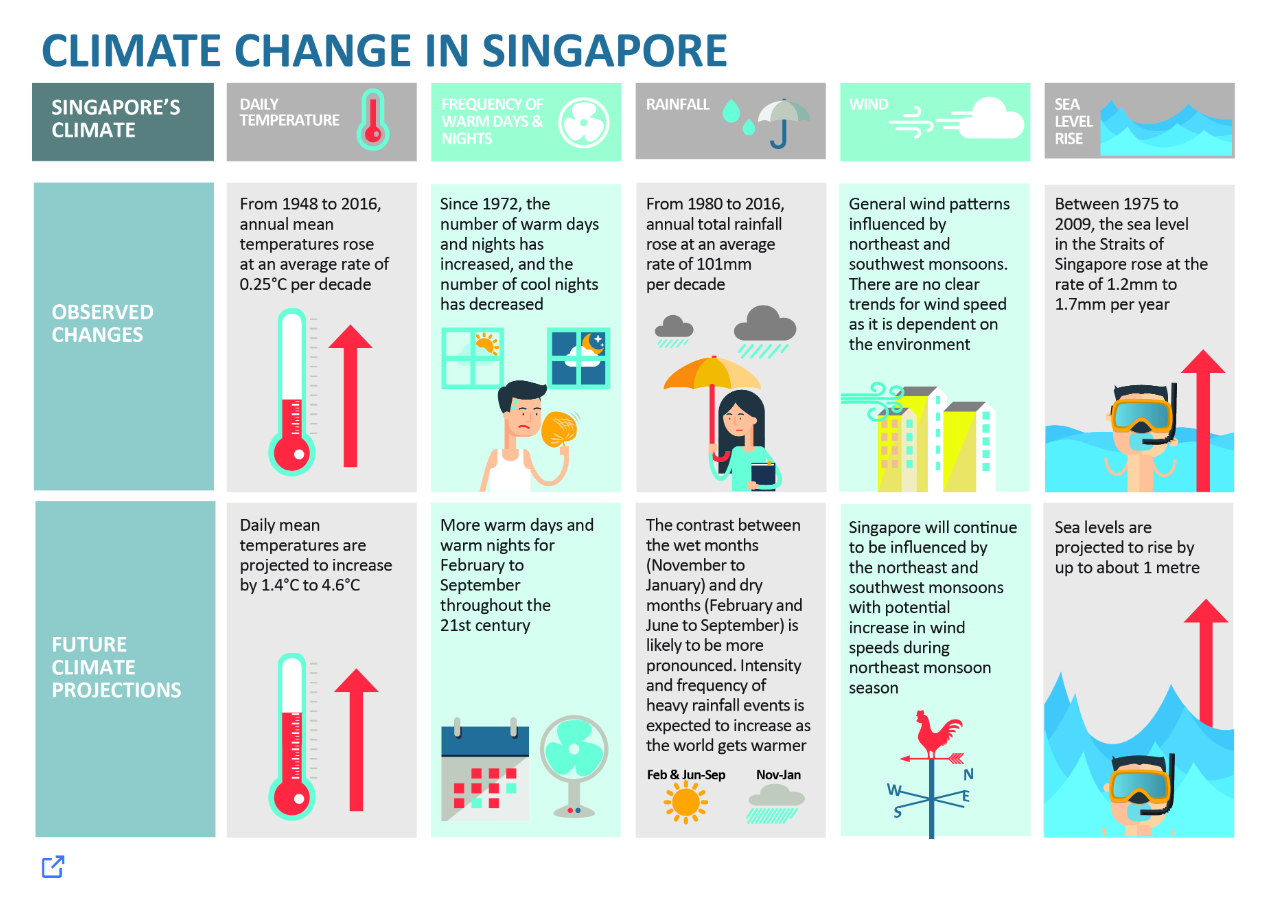
According to a report by the Ministry of Sustainability and Environment, the infographic below indicates that
From 1948 to 2016, the annual mean temperatures rose at an average rate of 0.25 °C per decade. The daily mean temperatures are projected to increase by 1.4 °C to 4.6 °C.
From 1980 to 2016, annual total rainfall rose at an average rate of 101 mm per decade. The contrast between the wet months (November to January) and dry months (February and June to September) is likely to be more pronounced.
The following figure is taken from Meteorological Service Singapore (MSS) website. It shows the mean monthly temperature variation (ºC) from 1991 to 2020 at Changi Climate Station.
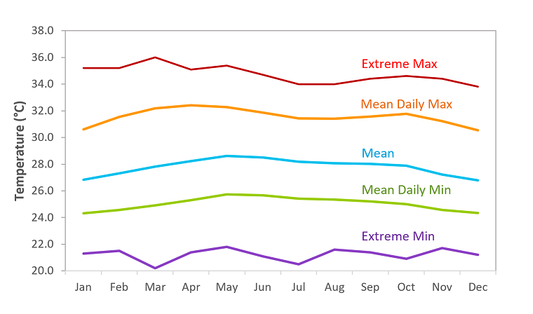
Compared to countries in the temperate regions, temperatures in Singapore vary little from month to month. The daily temperature range has a minimum usually not falling below 23-25ºC during the night and a maximum not rising above 31-33ºC during the day. May has the highest average monthly temperature (24-hour mean of 28.6ºC) and December and January are the coolest (24-hour mean of 26.8ºC).
As a visual analytics greenhorn, we will apply newly acquired visual interactivity and visualising uncertainty methods to validate the claims presented above.
1.1 The Task
In this exercise, we are required to:
Select a weather station and download historical daily temperature or rainfall data from Meteorological Service Singapore (MSS) website,
Select either daily temperature or rainfall records of a month of the year 1983, 1993, 2003, 2013 and 2023 and create an analytics-driven data visualisation,
Apply appropriate interactive techniques to enhance the user experience in data discovery and/or visual story-telling.
2. Data Preparation
2.1 Installing R packages
The code below uses p_load() of the Pacman package to check if all the required packages are installed on the laptop. If they are, then they will be launched into the R environment.
2.2 Importing data
Based on the MSS website, we can download the monthly data of a selected climate station each time. As such, I have written a robotic process automation bot using UIPath software to download all the monthly data recorded at Changi climate station, the oldest climate station near Changi Airport, and then combine all the CSV files and save the data in one CSV file.
weather <- read_csv("data/Changi.csv")
glimpse(weather)
Rows: 16,071
Columns: 13
$ Station <chr> "Changi", "Changi", "Changi", "Changi", "C…
$ Year <dbl> 1980, 1980, 1980, 1980, 1980, 1980, 1980, …
$ Month <dbl> 1, 1, 1, 1, 1, 1, 1, 1, 1, 1, 1, 1, 1, 1, …
$ Day <dbl> 1, 2, 3, 4, 5, 6, 7, 8, 9, 10, 11, 12, 13,…
$ `Daily Rainfall Total (mm)` <dbl> 0.0, 0.0, 0.0, 0.0, 8.0, 9.1, 7.9, 0.0, 0.…
$ `Daily Rainfall Total` <chr> "�", "�", "�", "�", "�", "�", "�", "�", "�…
$ `Highest 30 Min Rainfall` <chr> "�", "�", "�", "�", "�", "�", "�", "�", "�…
$ `Highest 120 Min Rainfall` <chr> "�", "�", "�", "�", "�", "�", "�", "�", "�…
$ `Mean Temperature` <chr> "�", "�", "�", "�", "�", "�", "�", "�", "�…
$ `Maximum Temperature` <chr> "�", "�", "�", "�", "�", "�", "�", "�", "�…
$ `Minimum Temperature` <chr> "�", "�", "�", "�", "�", "�", "�", "�", "�…
$ `Mean Wind Speed (km/h)` <chr> "�", "�", "�", "�", "�", "�", "�", "�", "�…
$ `Max Wind Speed (km/h)` <chr> "�", "�", "�", "�", "�", "�", "�", "�", "�…2.3 Change data type
This exercise will focus on the analysis of how temperature changes over the years so we select the relevant columns and the temperature column names are shortened for easy reference.
We can see that columns “Year”, “Month” and “Day” are double data types whereas “Mean Temperature”, “Maximum Temperature”, and “Minimum Temperature” are character data types. These are wrongly classified.
Let’s change “Year” and “Day” to integer data type, and the temperature-related variables should be numeric.
As for the values in the column “Month”, they will be replaced by the abbreviation of the respective months.
We remove the data records for years 1980 and 1981 as there are no temperature records.
weather <- weather %>%
          select(2:4, 9:11, "MeanTemp" = 9, "MaxTemp" = 10, "MinTemp" = 11 )

weather$Year <- as.integer(weather$Year)
weather$Month <- month.abb[weather$Month]
weather$Day <- as.integer(weather$Day)
weather$MeanTemp <- as.numeric(weather$MeanTemp)
weather$MaxTemp <- as.numeric(weather$MaxTemp)
weather$MinTemp <- as.numeric(weather$MinTemp)

weather <- weather %>%
          filter(Year != 1980 & Year != 1981)
glimpse(weather)
Rows: 15,340
Columns: 6
$ Year <int> 1982, 1982, 1982, 1982, 1982, 1982, 1982, 1982, 1982, 1982, 1…
$ Month <chr> "Jan", "Jan", "Jan", "Jan", "Jan", "Jan", "Jan", "Jan", "Jan"…
$ Day <int> 1, 2, 3, 4, 5, 6, 7, 8, 9, 10, 11, 12, 13, 14, 15, 16, 17, 18…
$ MeanTemp <dbl> 25.3, 24.7, 25.7, 26.3, 25.8, 23.7, 23.7, 24.4, 25.4, 25.6, 2…
$ MaxTemp <dbl> 29.4, 26.2, 27.2, 29.8, 28.8, 24.9, 25.2, 27.6, 28.3, 29.3, 2…
$ MinTemp <dbl> 23.0, 23.5, 24.0, 24.1, 23.5, 21.9, 22.4, 22.8, 23.5, 23.2, 2…2.4 Filter data
For this exercise, we will focus on the daily temperature records in the years 1983, 1993, 2003, 2013 and 2023. Hence, we will filter the data rows by the years.
weather_data <- weather %>%
          filter(Year %in% c("1983", "1993", "2003", "2013", "2023"))
colSums(is.na(weather_data))
Year Month Day MeanTemp MaxTemp MinTemp
0 0 0 0 0 0 summary(weather_data) Year Month Day MeanTemp
Min. :1983 Length:1825 Min. : 1.00 Min. :23.00
1st Qu.:1993 Class :character 1st Qu.: 8.00 1st Qu.:26.90
Median :2003 Mode :character Median :16.00 Median :27.70
Mean :2003 Mean :15.72 Mean :27.73
3rd Qu.:2013 3rd Qu.:23.00 3rd Qu.:28.70
Max. :2023 Max. :31.00 Max. :30.70
MaxTemp MinTemp
Min. :23.80 Min. :20.90
1st Qu.:30.70 1st Qu.:24.10
Median :31.80 Median :25.00
Mean :31.53 Mean :25.04
3rd Qu.:32.60 3rd Qu.:26.00
Max. :35.80 Max. :29.00
Observations
There are a total of 1825 observations with 6 variables.
There are no missing data in these 6 variables.
The average daily mean, maximum and minimum temperatures for these selected years are 27.73°C, 31.53°C and 25.04°C respectively.
2.5 Create useful columns and summarise dataset
It might be useful to look at the trend of daily temperatures by month of each year. Hence we will group the data by year and month, and then averaging the mean temperature and getting the maximum and minimum temperature in each month.
To plot a line chart, it might be good to have a column to show the dates, hence we create two columns to show the dates and day of the year.
Lastly, we also want to visualise the 99% confidence interval from the annual mean temperatures, hence we created another dataset to summarize the mean and standard deviation.
weather_data$DDate <- as.Date(paste(weather_data$Year,
                                    weather_data$Month,
                                    weather_data$Day, sep = "-"),
                              format = "%Y-%b-%d")

# join 1993 Jan 1 to 1983 Dec 31 by setting it to Day 365+1 = 366.
#Do the same for the other years
weather_data <- weather_data %>%
  mutate(DayOfYear = yday(DDate) + (Year - 1983)/10 * 365)

weather_month <- weather_data %>%
                group_by(Year, Month) %>%
                summarise(AveMeanTemp = mean(MeanTemp),
                          MaxMaxTemp = max(MaxTemp),
                          MinMinTemp = min(MinTemp))

Ave_temp <- weather_month %>%
  mutate(MonthOfYear = match(Month, month.abb) + (Year - 1983)/10 * 12 )

mean_error <- weather_data %>%
  group_by(Year) %>%
  summarise(n = n(), Temp = mean(MeanTemp), sd = sd(MeanTemp)) %>%
  mutate(se = sd/sqrt(n-1))
3. Temperature trends based on historical data
3.1 Overall distribution of temperature across the 5 years
Let’s take a look at the distribution of days with temperature values binned in 0.2ºC for the selected years.
Show the code
ggplot(data = weather_data, aes(x = MeanTemp)) +
  geom_histogram(bins = 50,
                 binwidth = 0.2,
                 boundary = 100,
                 color="grey",
                 fill="lightblue") +
  geom_density(aes(y = after_stat(density) * nrow(weather_data) * 0.2),
                   colour = "darkgreen") +
  geom_vline(data = weather_data,
             aes(xintercept = mean(MeanTemp)),
             linetype = "dashed", linewidth = 1, colour = "brown") +
  geom_label(aes(x = 28.5, y = 120,
                 label = paste0("Mean : ", round(mean(MeanTemp),2), "°C")),
            stat = "unique", colour = "brown", fill = "transparent") +
  theme_minimal() +
  labs(title = "Distribution of Daily Mean Temperatures",
       subtitle = "For years 1983, 1993, 2003, 2013 and 2023",
       y = "Number of days",
       x = "Daily mean temperatures (°C)",
       caption = "Data from Meteorological Service Singapore website") +
  theme(plot.title = element_text(face = "bold"))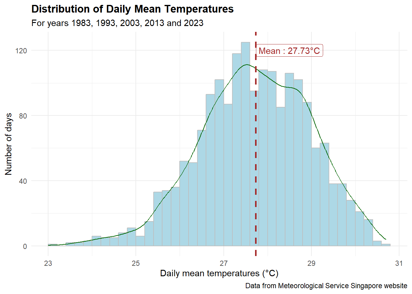
Observation
It looks like a normal distribution with an average daily mean temperature of 27.73 ºC.
However, it is in fact a little left-skewed (there are everal days with temperatures below 25 ºC).
Show the code
gg <- ggplot(weather_data, aes(x = DayOfYear, y = MeanTemp,
                         color = factor(Year))) +
    geom_line(linewidth = 0.1) +
    geom_point(aes(text = paste("Date:", DDate,
                                "<br>MeanTemp:", MeanTemp, "ºC"))) +
    scale_x_continuous(breaks = c(0, 365, 365 *2, 365 *3, 365 * 4),
                       labels = c(1983, 1993, 2003, 2013, 2023)) +
    labs(x = "Year", y = "Daily mean temperature (ºC)", color = "Year",
         title = "Trend of Daily Mean Temperature in Years 1983, 1993, 2003, 2013 and 2023",
         subtitle = "Gentle trend line sloping upwards from 1993",
         caption = "Data from Meteorological Service Singapore website") +
    geom_smooth(method = "lm", formula = y ~ splines::bs(x, 3),
                se = FALSE, color = "black") +
    theme_minimal()

ggplotly(gg, tooltip = "text") %>%
    layout(title = list(text =
                        paste0(gg$labels$title, "<br>", "<sup>",
                               gg$labels$subtitle, "</sup>"),
                        font = list(weight = "bold")),
    annotations = list(text = gg$labels$caption,
                      xref = "paper", yref = "paper",
                      x = 1000, y = 24,
                      xanchor = "right", yanchor = "top",
                      showarrow = FALSE))
Observations
The pattern is similar for the years 1993, 2003, 2013, and 2023 as we have cooler days in January and December and hotter days in May and June.
However, in 1983, the hottest days are in April and the days in January are not as cool as the other days in January of other years.
From the trend line (in black), we can see that the daily mean temperature is gently increasing from 1993 onwards.
3.2 Distribution of daily mean temperatures by months
Show the code
gg <- ggplot(weather_data,
       aes(x = factor(Month, levels = month.abb), y = MeanTemp)) +
  geom_violin(color = "navy", fill = "lightblue") +
  geom_hline(data = weather_data,
             aes(yintercept = mean(MeanTemp)),
             linetype = "dashed", size = 1, colour = "brown") +
  geom_text(aes(x = 4.5, y = 27.3,
                 label = paste0("Mean : ", round(mean(MeanTemp),2), "°C")),
            colour = "brown") +
  stat_summary(fun = mean, geom = "point",
               shape = 20, size = 3, color = "orange",
               aes(text = paste0("Mean : ", round(after_stat(y), 2), "°C"))) +
  theme_minimal() +
  labs(title = "Daily mean temperature across each month of years \n1983, 1993, 2003, 2013 and 2023",
       subtitle = "November to February are cooler as compared to the rest of the year",
        y = "Daily mean Temperatures (°C)",
        x = "Month",
        caption = "Data from Meteorological Service Singapore website")

ggplotly(gg, tooltip = "text") %>%
    layout(title = list(text =
                        paste0(gg$labels$title, "<br>", "<sup>",
                               gg$labels$subtitle, "</sup>"),
                        font = list(weight = "bold")))
Observations
The box plot above resonates well with what was mentioned on the MSS website.
‘The daily temperature range has a minimum usually not falling below 23-25ºC during the night and a maximum not rising above 31-33ºC during the day.’ Indeed from the plot above, the temperature ranges from 23ºC to 31ºC.
‘May has the highest average monthly temperature (24-hour mean of 28.6ºC) and December and January are the coolest (24-hour mean of 26.8ºC).’ From the plot above, May and June have the highest average monthly temperatures close to 29ºC, whereas December and January are the coolest with average temperatures below 27ºC.
3.3 Trends of daily mean temperature by year
Show the code
gg <- ggplot(weather_month,
       aes(x = factor(Month, levels = month.abb), y = AveMeanTemp,
           group = Year, color = factor(Year))) +
    geom_point(aes(color = factor(Year),
                   text = paste(Year, "-", Month,
                                "<br>MeanTemp:", round(AveMeanTemp, 2), "ºC"))) +
    geom_line() +
    labs(x = "Month",
       y = "Mean Temperatures (°C)",
       title = "Mean Temperatures variation throughout the year",
       subtitle = "Hotter days from mid May 2023 as compared to years 1983, 1993, 2003 and 2013",
       caption = "Data from Meteorological Service Singapore website") +
  scale_color_discrete(name = "Year") +
  theme_minimal() +
  theme(plot.title = element_text(face = "bold"))

ggplotly(gg, tooltip = "text") %>%
    layout(title = list(text =
                        paste0(gg$labels$title, "<br>", "<sup>",
                               gg$labels$subtitle, "</sup>"),
                        font = list(weight = "bold")))
Observations
The mean temperatures in 2023 are higher from May to December as compared to the other 4 years.
Using the calendar heatmap, we are able to see that more months in 2023 are hotter as compared to the previous years.
Show the code
gg <- ggplot(weather_month, aes(factor(Month, levels = month.abb), factor(Year),
                          fill = AveMeanTemp)) +
    geom_tile(color = "white",
              aes(text = paste0(Year, "-", Month,
                                "<br>Temp:", round(AveMeanTemp, 2), "°C"))) +
    theme_minimal() +
    scale_fill_gradient(name = "Temperature",
                        low = "sky blue",
                        high = "dark blue") +
    labs(x = NULL, y = NULL,
         title = "Mean temperatures by year and month",
         subtitle = "Hotter in more months of 2023 as compared to the other years")

ggplotly(gg, tooltip = "text")
3.4 Confidence interval of annual mean temperatures by year
Show the code
model <- lm(Temp ~ Year, mean_error)
y_intercept = coef(model)[1]
slope_coeff = coef(model)[2]
adjust_yintercept = slope_coeff * 1973 + y_intercept

gg <- ggplot(mean_error) +
       geom_errorbar(aes(x = factor(Year), ymin = Temp - 2.58 * se,
                      ymax = Temp+2.58*se),
                      width=0.2, colour="black",
                      alpha=0.9, size=0.5) +
       geom_point(aes(x = factor(Year), y = Temp,
             text = paste0("Year:", `Year`,
                          "<br>Avg. Temp:", round(Temp, digits = 2),
                          "<br>95% CI:[",
                          round((Temp - 2.58 * se), digits = 2), ",",
                          round((Temp + 2.58 * se), digits = 2),"]")),
             stat="identity", color="darkred",
             size = 1.5, alpha = 1) +
       geom_abline(slope = round(slope_coeff,4) * 10,
                   intercept = adjust_yintercept,
                   untf = TRUE,
                   color = "blue",
                   linetype = "dashed")+
       geom_text(aes(x = 4, y = 28, colour = "blue",
                     label = paste0("Temp=",
                                    round(slope_coeff, 4), "* Year + ",
                                    round(y_intercept, 4)))) +
       labs (x = "Year", y = "Annual mean temperatures (°C)",
             title = "99% Confidence interval of annual mean temperatures by year",
             subtitle = "Confidence interval for 2023 does not overlap with the rest",
             caption = "Data from Meteorological Service Singapore website") +
       theme_minimal() +
       theme(axis.text.x = element_text(vjust = 0.5, hjust=1),
             plot.title = element_text(face = "bold", size = 12))

ggplotly(gg, tooltip = "text") %>%
    layout(title = list(text =
                        paste0(gg$labels$title, "<br>", "<sup>",
                               gg$labels$subtitle, "</sup>"),
                        font = list(weight = "bold")),
           showlegend = FALSE)
Observations
The 99% confidence interval of the average daily mean temperature of 2023 is the only one that does not overlap with the other years’ confidence interval. That means that its confidence interval is too far off from the rest.
A linear regression is calculated for all the 5 points and the slope of the regression line is 0.0125°C. This means that for every 10 years, the annual mean temperature increases by 0.125°C (somewhat far from what is stated on the MSS website).
Since we have the temperature data from 1982 to 2023, let fit them into the linear regression model.
Show the code
mean_error_all <- weather %>%
  group_by(Year) %>%
  summarise(n = n(), Temp = mean(MeanTemp), sd = sd(MeanTemp)) %>%
  mutate(se = sd/sqrt(n-1))

model <- lm(Temp ~ Year, mean_error_all)
y_intercept = coef(model)[1]
slope_coeff = coef(model)[2]
adjust_yintercept = slope_coeff * 1982 + y_intercept

gg <- ggplot(mean_error_all) +
       geom_errorbar(aes(x = factor(Year), ymin = Temp - 2.58 * se,
                      ymax = Temp+2.58*se),
                      width=0.2, colour="black",
                      alpha=0.9, size=0.5) +
       geom_point(aes(x = factor(Year), y = Temp,
             text = paste0("Year:", `Year`,
                          "<br>Avg. Temp:", round(Temp, digits = 2),
                          "<br>95% CI:[",
                          round((Temp - 2.58 * se), digits = 2), ",",
                          round((Temp + 2.58 * se), digits = 2),"]")),
             stat="identity", color="darkred",
             size = 1.5, alpha = 1) +
       geom_abline(slope = round(slope_coeff, 4),
                   intercept = adjust_yintercept,
                   untf = TRUE,
                   color = "blue",
                   linetype = "dashed")+
       geom_text(aes(x = 11, y = 27.8, colour = "blue",
                     label = paste0("Temp=",
                                    round(slope_coeff, 4), "* Year ",
                                    round(y_intercept, 4)))) +
       labs (x = "Year", y = "Annual mean temperatures (°C)",
             title = "99% Confidence interval of annual mean temperatures by year",
             subtitle = "From 1982 to 2023",
             caption = "Data from Meteorological Service Singapore website") +
       theme_minimal() +
       theme(axis.text.x = element_text(angle = 45, vjust = 0.5, hjust=1),
             plot.title = element_text(face = "bold", size = 12))

ggplotly(gg, tooltip = "text") %>%
    layout(title = list(text =
                        paste0(gg$labels$title, "<br>", "<sup>",
                               gg$labels$subtitle, "</sup>"),
                        font = list(weight = "bold")),
           showlegend = FALSE)
Observations
The slope of the regression line is 0.0217, which means for every year, there is an increase of 0.0217°C. Hence, for every decade, there will be an increase of approximately 0.22°C, which is quite similar to what was stated in the infographic by MSE.
According to Figure 1 on this website, the annual average temperatures from 1948 to 1981 are generally lower than 27°C, which makes the difference in temperatures as compared to the later decades wider. This means an increase of approximately 0.25°C per decade from 1948 to 2023 is possible.
4. Visual Statistical Analysis
4.1 One-sample test on Daily Mean Temperature
In this MSS annual report 2023, the annual mean temperature in 2023 was 28.2°C. Let us conduct a one-sample test to compare with the 5 years’ records.
Show the code
gghistostats(data = weather_data, x = MeanTemp,
            type = "bayes",
            test.value = 28.2) +
  labs(x = "Daily mean temperatures") +
  theme_minimal()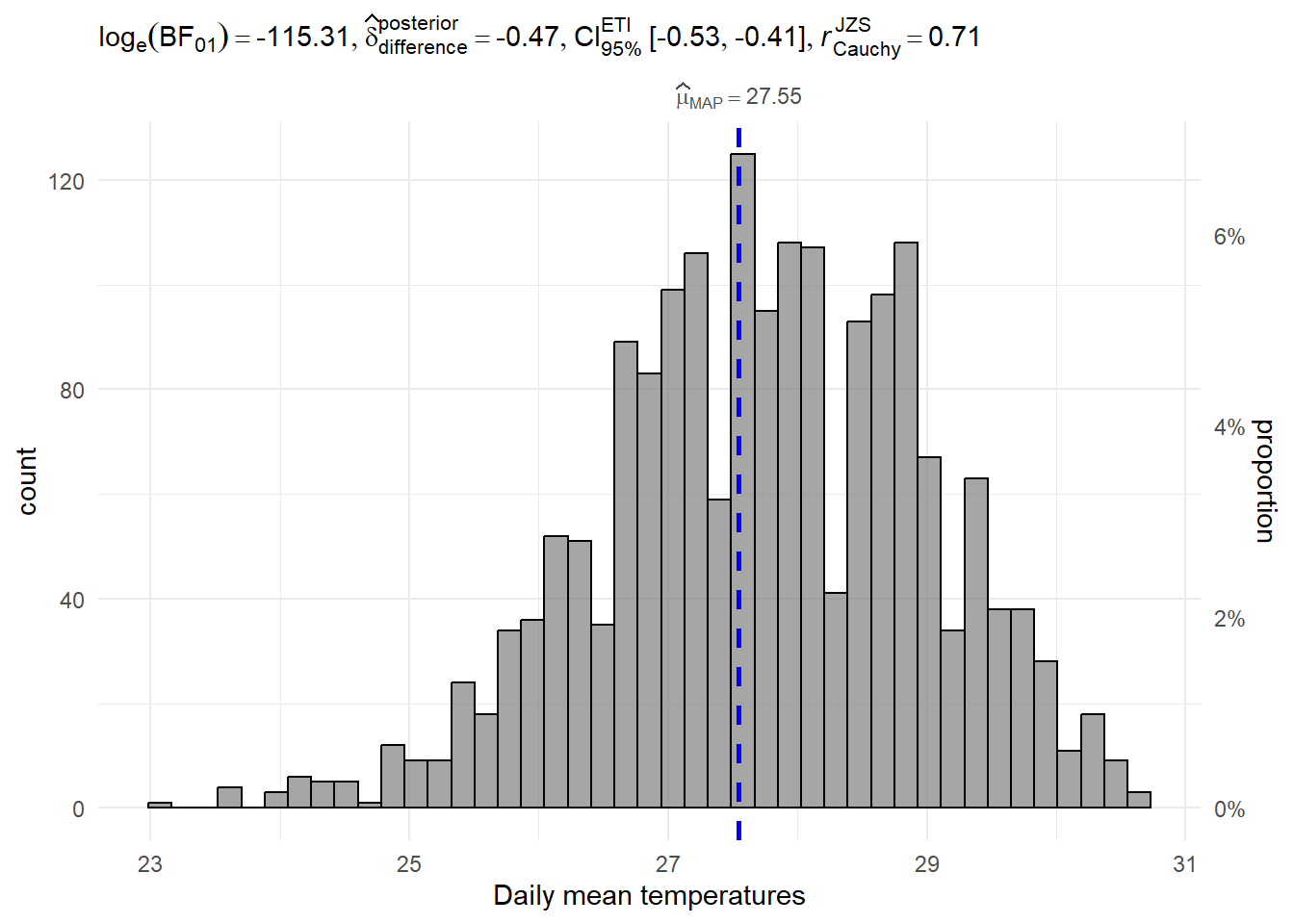
Interpretation of results
log(BF01) = - 115.31 is a very small negative value, which means that the past 5 years’ mean temperatures are significantly different from the test value (i.e. 28.2°C).
4.2 One-way Anova test on daily mean temperatures by year
Show the code
ggbetweenstats(data = weather_data, x = Year, y = MeanTemp,
              type = "p",
              mean.ci = TRUE,
              pairwise.comparisons = TRUE,
              pairwise.display = "s", #show significant pair only
              p.adjust.method = "fdr",
              messages = FALSE) +
  labs(y = "Daily mean temperatures",
       title = "One-way Anova Test on Daily Mean Temperatures by Year")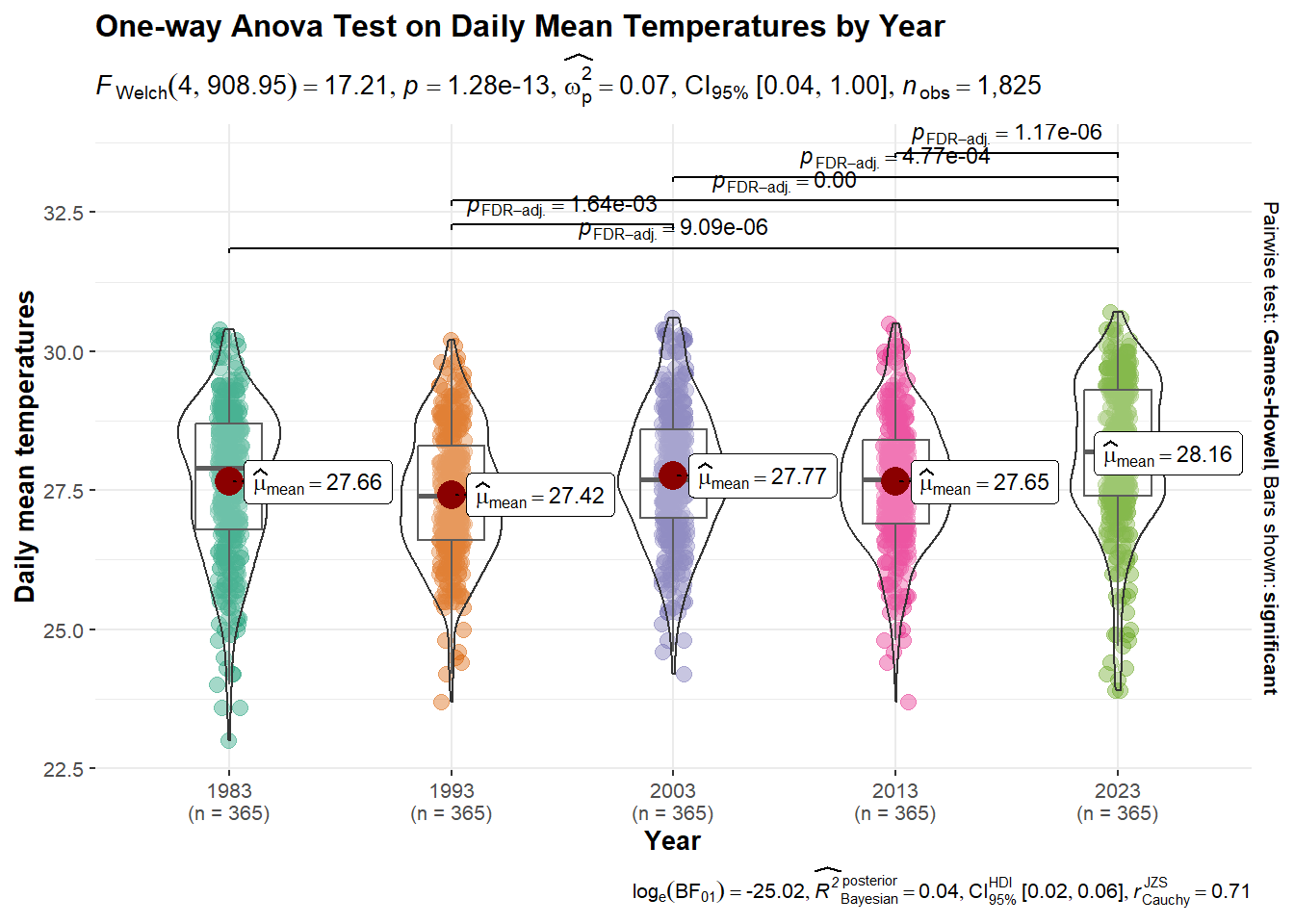
Interpretation of results
From the above Anova test, we can conclude that the annual mean temperatures are significantly different in 2023 when compared with the years 1983, 1993, 2003, and 2013. The annual mean temperatures are significantly different for the years 1993 and 2003 too.
5. Conclusion
In this exercise, we aimed to explore the historical trends and patterns of daily temperature in Singapore, using data from the MSS website. December and January are usually the cooler months in a year whereas May and June are the hottest months. There has been a significant increase in the average daily temperature over the years, especially in 2023. The statement made by MSE in the infographic seems to be true ‘The annual mean temperatures rose at an average rate of 0.25 °C per decade.’, as we have found that there is an average rate of 0.22°C per decade using 1982 to 2023 data.