pacman::p_load(ggdist, ggridges, ggthemes,
colorspace, tidyverse)Hands-on Exercise 4a: Visualing Distributions
1 Overview
This exercise explores two relatively new statistical graphic methods for visualising distribution, namely the ridgeline plot and raincloud plot by using ggplot2 and its extensions.
2 Getting Started
2.1 Installing and loading the packages
For this exercise, the following R packages will be used, they are:
tidyverse, a family of R packages for data science processes,ggridges, a ggplot2 extension specially designed for plotting ridgeline plots, andggdistfor visualising distribution and uncertainty.
2.2 Data import
The following dataset is used for this exercise.
exam_data <- read_csv("data/Exam_data.csv")3 Visualising Distribution: Ridgeline Plot
Ridgeline plot (sometimes called Joyplot) is a data visualisation technique for revealing the distribution of a numeric value for several groups. Distribution can be represented using histograms or density plots, all aligned to the same horizontal scale and presented with a slight overlap.
Note
Ridgeline plots make sense when the number of groups to represent is medium to high (>= 5 groups), and thus a classic window separation would take too much space. Indeed, the fact that groups overlap each other allows us to use space more efficiently. If the number of groups is less than 5 groups, dealing with other distribution plots is probably better.
It works well when there is a clear pattern in the result, like if there is an obvious ranking in groups. Otherwise, groups will tend to overlap each other, leading to a messy plot not provide any insight.
3.1 Plotting ridgeline graph using** ggridges method
There are several ways to plot a ridgeline plot with R. In this section, you will learn how to plot ridgeline plot by using ggridges package.
ggridges package provides two main geom to plot gridgeline plots:
geom_ridgeline()takes height values directly to draw the ridgelinesgeom_density_ridges()estimates data densities and then draws those using ridgelines
The ridgeline plot below is plotted by using geom_density_ridges().
Show the code
ggplot(exam_data,
       aes(x = ENGLISH, y = CLASS)) +
  geom_density_ridges(
    scale = 3,
    rel_min_height = 0.01,
    bandwidth = 3.4,
    fill = lighten("#7097BB", .3),
    color = "white") +
  scale_x_continuous(
    name = "English grades",
    expand = c(0, 0)) +
  scale_y_discrete(name = NULL,
                   expand = expansion(add = c(0.2, 2.6))) +
  theme_ridges()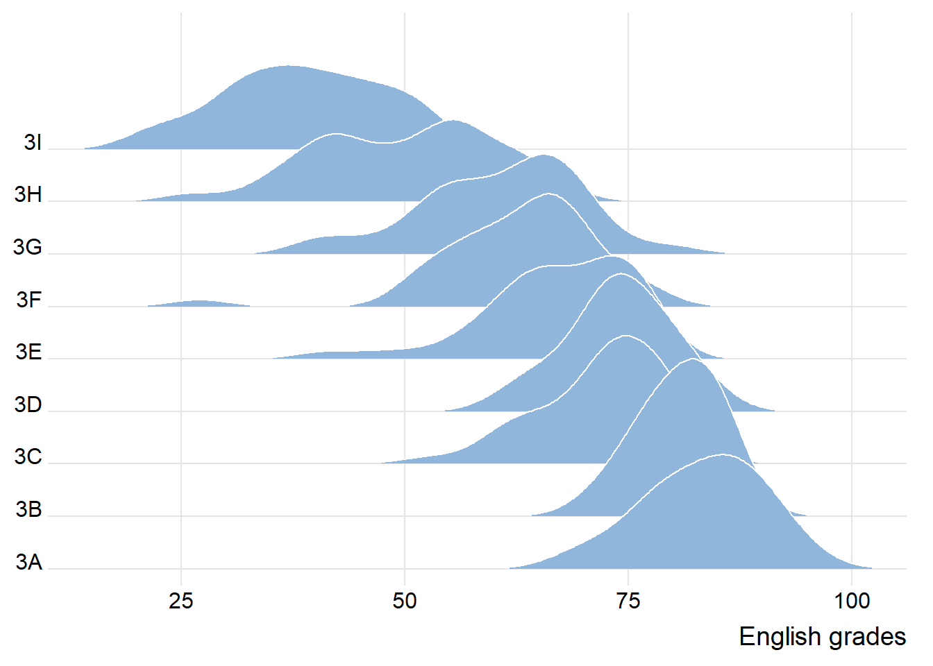
Important
To plot a density ridges chart, we need to have one continuous variable and one categorical variable.
The density ridges chart is a smooth curve (interpolated from actual points), not the actual points. Hence, do not add interactivity to this chart.
Use this chart to show the shape of the distribution (skewness/spread of the distribution or resemble normal distribution).
3.2 Varying fill colours along the x-axis
Let’s change the area under a ridgeline filled with colours that vary in some form along the x-axis. This effect can be achieved by using either geom_ridgeline_gradient() or geom_density_ridges_gradient(). Both geoms work just like geom_ridgeline() and geom_density_ridges(), except that they allow for varying fill colours.
However, they do not allow for alpha transparency in the fill. For technical reasons, we can have changing fill colors or transparency but not both.
option is a character string indicating the colour map option to use. Eight options are available: “magma” (or “A”) “inferno” (or “B”) “plasma” (or “C”) “viridis” (or “D”) “cividis” (or “E”) “rocket” (or “F”) “mako” (or “G”) “turbo” (or “H”)
Show the code
ggplot(exam_data,
       aes(x = ENGLISH,
           y = CLASS,
           fill = after_stat(x))) +
  geom_density_ridges_gradient(scale = 3,
                            rel_min_height = 0.01) +
  scale_fill_viridis_c(name = "Score",
                       option = "C") +
  scale_x_continuous(name = "English grades",
                  expand = c(0, 0)) +
  scale_y_discrete(name = NULL,
                   expand = expansion(add = c(0.2, 2.6))) +
  theme_ridges()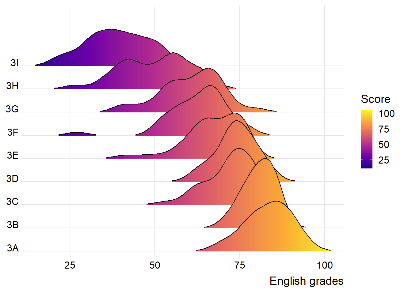
3.3 Mapping the probabilities directly onto colour
Beside providing additional geom objects to support the need to plot ridgeline plot, ggridges package also provides a stat function called stat_density_ridges() that replaces stat_density() of ggplot2.
The following is plotted by mapping the probabilities calculated by using stat(ecdf) which represents the empirical cumulative density function for the distribution of English scores.
Show the code
ggplot(exam_data,
       aes(x = ENGLISH,
           y = CLASS,
           fill = 0.5 - abs(0.5 - after_stat(ecdf)))) +
  stat_density_ridges(geom = "density_ridges_gradient",
                      calc_ecdf = TRUE) +
  scale_fill_viridis_c(name = "Probability",
                       direction = -1) +
  scale_x_continuous(name = "English grades",
                  expand = c(0, 0)) +
  scale_y_discrete(name = NULL,
                   expand = expansion(add = c(0.2, 2.6))) +
  theme_ridges()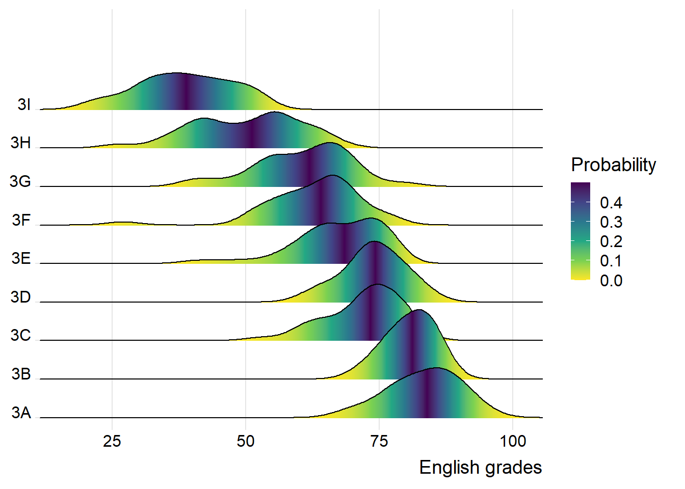
Note
You would be able to compare the 50th percentile easily as well as those 10th and 90th percentile.
3.4 Ridgeline plots with quantile lines
By using geom_density_ridges_gradient(), we can colour the ridgeline plot by quantile, via the calculated after_stat(quantile) aesthetic as shown in the figure below.
Show the code
ggplot(exam_data,
       aes(x = ENGLISH,
           y = CLASS,
           fill = factor(after_stat(quantile)))) +
  stat_density_ridges(
          geom = "density_ridges_gradient",
          calc_ecdf = TRUE,
          quantiles = 4,
          quantile_lines = TRUE) +
  scale_fill_viridis_d(name = "Quartiles") +
  scale_x_continuous(name = "English grades",
                  expand = c(0, 0)) +
  scale_y_discrete(name = NULL,
                   expand = expansion(add = c(0.2, 2.6))) +
  theme_ridges()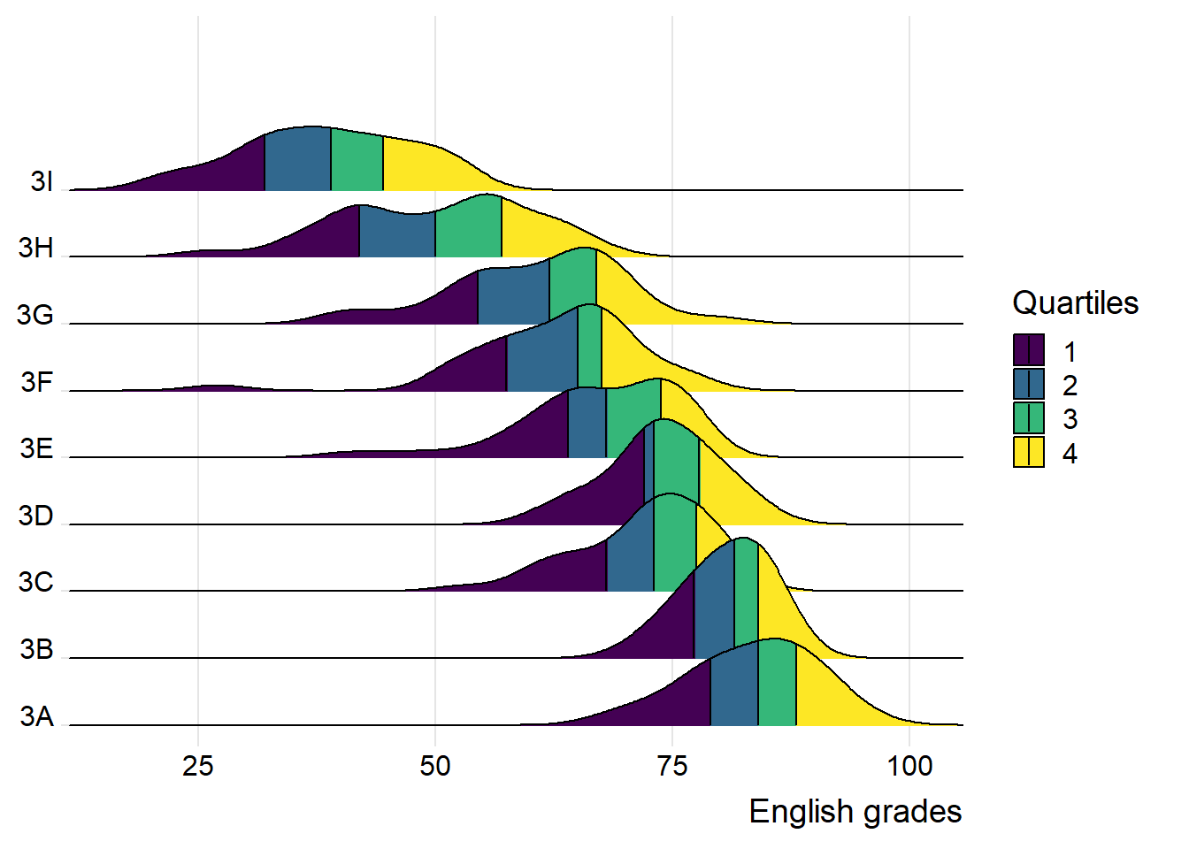
We can also specify quantiles by cut points such as 2.5% and 97.5% tails to colour the ridgeline plot as shown in the figure below.
Show the code
ggplot(exam_data,
       aes(x = ENGLISH,
           y = CLASS,
           fill = factor(stat(quantile)))) +
  stat_density_ridges(
          geom = "density_ridges_gradient",
          calc_ecdf = TRUE,
          quantiles = c(0.025, 0.975)) +
  scale_fill_manual(
      name = "Probability",
      values = c("#FF0000A0", "#A0A0A0A0", "#0000FFA0"),
      labels = c("(0, 0.025]", "(0.025, 0.975]", "(0.975, 1]"))+
  scale_x_continuous(name = "English grades",
                  expand = c(0, 0)) +
  scale_y_discrete(name = NULL,
                   expand = expansion(add = c(0.2, 2.6))) +
  theme_ridges()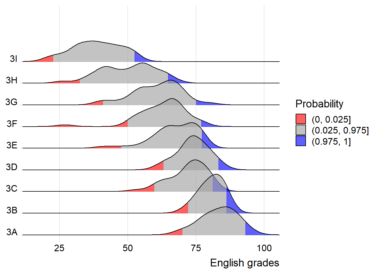
4 Visualising Distribution: Raincloud Plot
A Raincloud Plot is a data visualisation technique that produces a half-density to a distribution plot. It gets the name because the density plot is in the shape of a “raincloud”. The raincloud (half-density) plot enhances the traditional boxplot by highlighting multiple modalities (an indicator that groups may exist). The boxplot does not show where densities are clustered, but the raincloud plot does!
Raincloud plot will be created by using functions provided by ggdist and ggplot2 packages.
There are 4 steps to create a raincloud plot.
First, we will plot a Half-Eye graph by using stat_halfeye() of ggdist package.
This produces a Half-Eye visualization, which contains a half-density and a slab-interval.
Show the code
ggplot(exam_data,
       aes(x = RACE, y = ENGLISH)) +
  stat_halfeye(adjust = 0.5,
               justification = -0.2,
               .width = 0,
               point_colour = NA)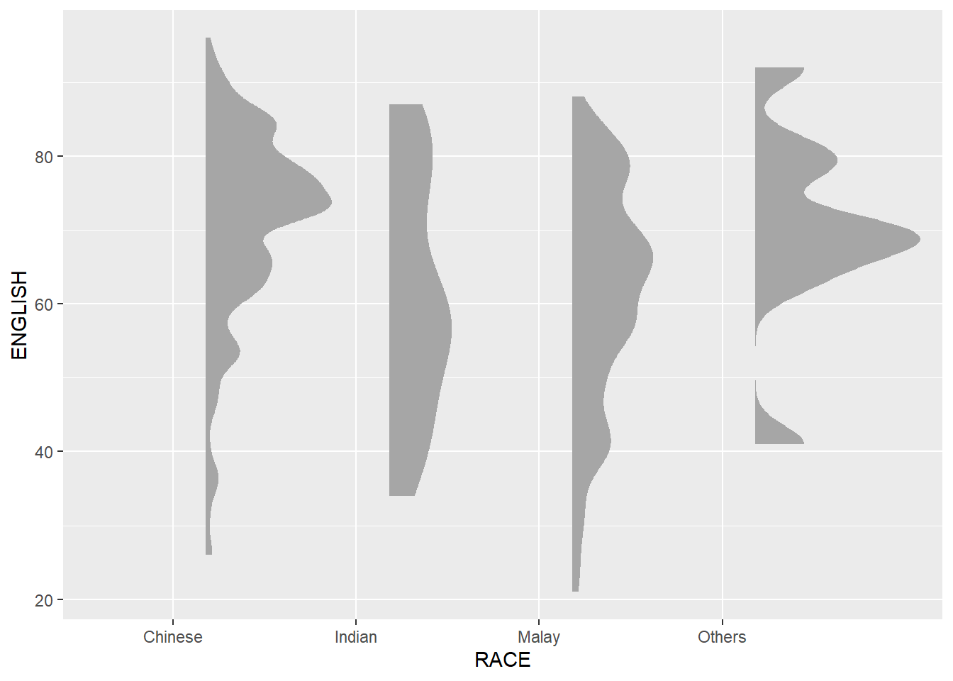
Note
We remove the slab interval by setting .width = 0 and point_colour = NA.
Next, we will add the second geometry layer using geom_boxplot() of ggplot2. This produces a narrow boxplot. We reduce the width and adjust the opacity.
Show the code
ggplot(exam_data,
       aes(x = RACE,
           y = ENGLISH)) +
  stat_halfeye(adjust = 0.5,
               justification = -0.2,
               .width = 0,
               point_colour = NA) +
  geom_boxplot(width = .20,
               outlier.shape = NA)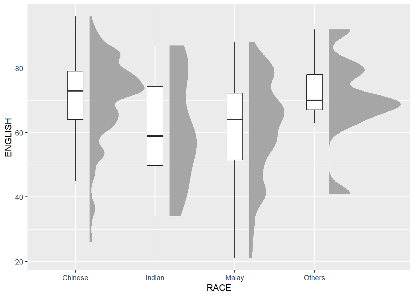
Next, we will add the third geometry layer using stat_dots() of ggdist package. This produces a half-dotplot, which is similar to a histogram that indicates the number of samples (number of dots) in each bin. We select side = “left” to indicate we want it on the left-hand side.
Show the code
ggplot(exam_data,
       aes(x = RACE,
           y = ENGLISH)) +
  stat_halfeye(adjust = 0.5,
               justification = -0.2,
               .width = 0,
               point_colour = NA) +
  geom_boxplot(width = .20,
               outlier.shape = NA) +
  stat_dots(side = "left",
            justification = 1.2,
            binwidth = .5,
dotsize = 2) 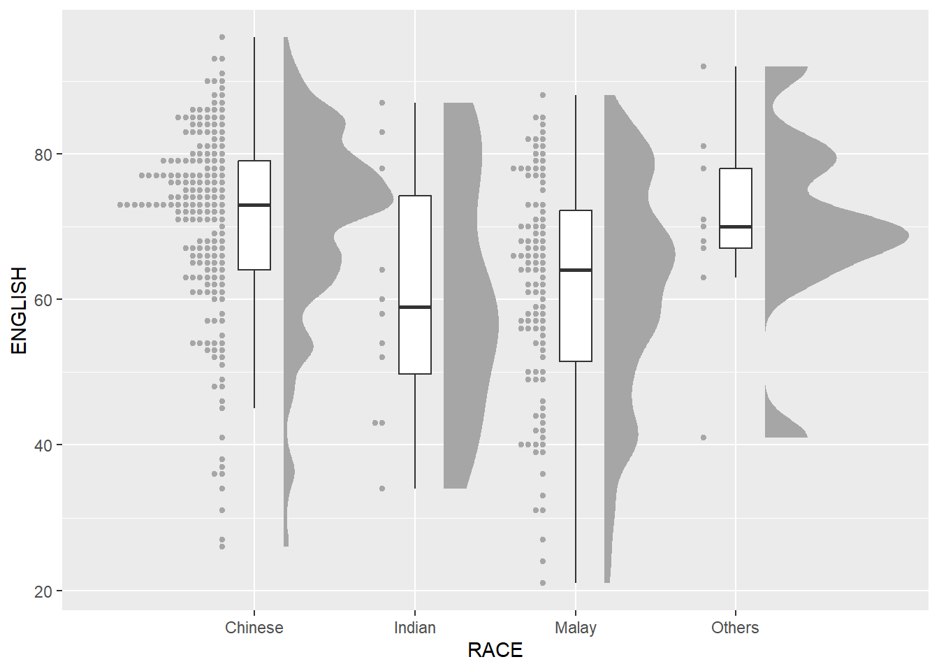
Lastly, coord_flip() of ggplot2 package will be used to flip the raincloud chart horizontally to give it the raincloud appearance. At the same time, theme_economist() of ggthemes package is used to give the raincloud chart a professional publishing standard look.
Show the code
ggplot(exam_data,
       aes(x = RACE,
           y = ENGLISH)) +
  stat_halfeye(adjust = 0.5,
               justification = -0.2,
               .width = 0,
               point_colour = NA) +
  geom_boxplot(width = .20,
               outlier.shape = NA) +
  stat_dots(side = "left",
            justification = 1.2,
            binwidth = .5,
            dotsize = 1.5) +
  coord_flip() +
  theme_economist()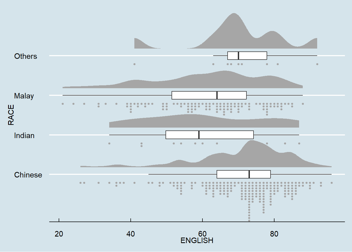
Note
We can see the sample size from the raincloud plot easily.