pacman::p_load(tidyverse, ggHoriPlot, ggthemes)In-class_Ex06: Time series charts
In this exercise, we create time-series charts in Tableau and R.
1. Tableau - Time-series charts
1.1. Line and Cycle charts
The dashboard consists of a line chart to show the air arrivals over the years and a cycle chart to show how the air arrivals change for each month. You can view it here.
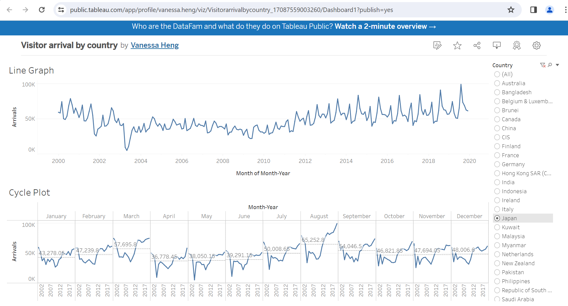
Note
In order to use only 1 filter for both charts, we have to apply one of the filters to all worksheets using the same data source and then keep one of the filters in the dasboard.
1.2 Calendar map
We can also create a calendar map in Tableau.
The timestamp column is used 3 times to create this calendar map.
Month and Week of timestamp in the
columnsof the chartWeekday of timestamp in the
rowsof the chart
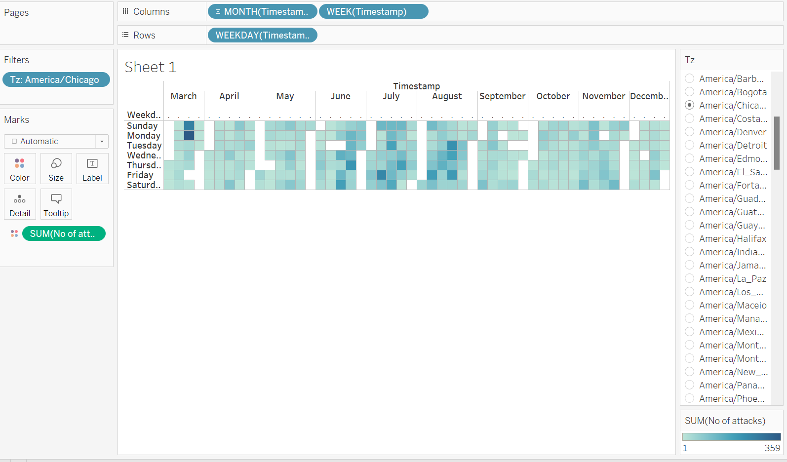
Note
There is a gap at the end and the start of each month as Tableau is not able to gel them together.
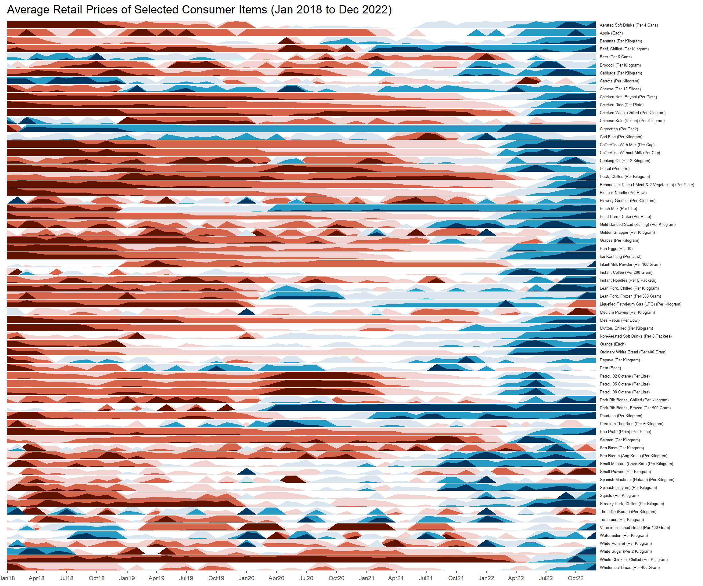
2. R - Horizon Graph
A horizon graph is an analytical graphical method specially designed for visualising large numbers of time-series. It aims to overcome the issue of visualising highly overlapping time-series.
A horizon graph essentially an area chart that has been split into slices and the slices then layered on top of one another with the areas representing the highest (absolute) values on top. Each slice has a greater intensity of colour based on the absolute value it represents.
2.1 Installing the packages
ggHoriPlot: create a horizon graph to show highly overlapping time-series.
2.2 Data import
In this exercise, Average Retail Prices Of Selected Consumer Items will be used.
We need to change the data format from character to Date format.
averp <- read_csv("data/AVERP.csv") %>%
  mutate(`Date` = dmy(`Date`))
2.3 Create horizon graph
averp %>%
  filter(Date >= "2018-01-01") %>%
  ggplot() +
  geom_horizon(aes(x = Date, y=Values),
               origin = "midpoint",
               horizonscale = 6) +
  facet_grid(`Consumer Items`~.) +
  theme_few() +
  scale_fill_hcl(palette = 'RdBu') +
  theme(panel.spacing.y=unit(0, "lines"), strip.text.y = element_text(
    size = 5, angle = 0, hjust = 0),
    legend.position = 'none',
    axis.text.y = element_blank(),
    axis.text.x = element_text(size=7),
    axis.title.y = element_blank(),
    axis.title.x = element_blank(),
    axis.ticks.y = element_blank(),
    panel.border = element_blank()) +
  scale_x_date(expand=c(0,0), date_breaks = "3 month", date_labels = "%b%y") +
  ggtitle('Average Retail Prices of Selected Consumer Items (Jan 2018 to Dec 2022)')