pacman::p_load(sf, tmap, tidyverse)Hands-on Exercise 7c: Analytical Mapping
1 Overview
In this in-class exercise, we will be able to use appropriate functions of tmap and tidyverse to plot analytical maps by
Importing geospatial data in RDS format into R environment.
Creating cartographic quality choropleth maps by using appropriate tmap functions.
Creating rate map
Creating percentile map
Creating boxmap
2 Getting Started
2.1 Installing and loading the packages
For this exercise, the following R packages will be used:
- sf for handling geospatial data.
2.2 Data import
The data set called called NGA_wp.rds, is a polygon feature data.frame providing information on water point of Nigeria at the LGA level.
NGA_wp <- read_rds("data/rds/NGA_wp.rds")3 Basic Choropleth Mapping
The following code chunk is to plot choropleth maps showing the distribution of functional and total water point by LGA and arrange them side by side.
p1 <- tm_shape(NGA_wp) +
  tm_fill("wp_functional",
          n = 10,
          style = "equal",
          palette = "Blues") +
  tm_borders(lwd = 0.1,
             alpha = 1) +
  tm_layout(main.title = "Distribution of functional water point by LGAs",
            legend.outside = FALSE)

p2 <- tm_shape(NGA_wp) +
  tm_fill("total_wp",
          n = 10,
          style = "equal",
          palette = "Blues") +
  tm_borders(lwd = 0.1,
             alpha = 1) +
  tm_layout(main.title = "Distribution of total  water point by LGAs",
            legend.outside = FALSE)

tmap_arrange(p2, p1, nrow = 1)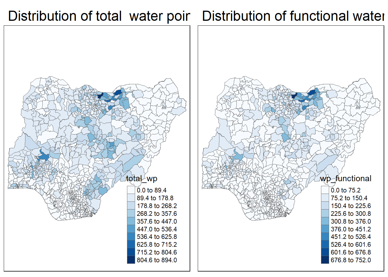
4 Choropleth Map for Rates
In much of our readings we have now seen the importance to map rates rather than counts of things, and that is for the simple reason that water points are not equally distributed in space. That means that if we do not account for how many water points are somewhere, we end up mapping total water point size rather than our topic of interest.
We will tabulate the proportion of functional water points and the proportion of non-functional water points in each LGA.
NGA_wp <- NGA_wp %>%
  mutate(pct_functional = wp_functional/total_wp) %>%
  mutate(pct_nonfunctional = wp_nonfunctional/total_wp)
The following code chunk is to plot a choropleth map showing the distribution of percentage functional water point by LGA.
tm_shape(NGA_wp) +
  tm_fill("pct_functional",
          n = 10,
          style = "equal",
          palette = "Blues",
          legend.hist = TRUE) +
  tm_borders(lwd = 0.1,
             alpha = 1) +
  tm_layout(main.title = "Rate map of functional water point by LGAs",
            legend.outside = TRUE)
5 Extreme Value Maps
Extreme value maps are variations of common choropleth maps where the classification is designed to highlight extreme values at the lower and upper end of the scale, with the goal of identifying outliers. These maps were developed in the spirit of spatializing EDA, i.e., adding spatial features to commonly used approaches in non-spatial EDA (Anselin 1994).
5.1 Percentile Map
The percentile map is a special type of quantile map with six specific categories: 0-1%,1-10%, 10-50%,50-90%,90-99%, and 99-100%. The corresponding breakpoints can be derived by means of the base R quantile command, passing an explicit vector of cumulative probabilities as c(0,.01,.1,.5,.9,.99,1). Note that the begin and endpoint need to be included.
Step 1: Exclude records with NA by using the code chunk below.
Step 1: Exclude records with NA by using the code chunk below.
NGA_wp <- NGA_wp %>%
  drop_na()
Step 2: Creating customised classification and extracting values
percent <- c(0,.01,.1,.5,.9,.99,1)
var <- NGA_wp["pct_functional"] %>%
  st_set_geometry(NULL)
quantile(var[,1], percent)
0% 1% 10% 50% 90% 99% 100%
0.0000000 0.0000000 0.2169811 0.4791667 0.8611111 1.0000000 1.0000000
Important
When variables are extracted from an sf data.frame, the geometry is extracted as well. For mapping and spatial manipulation, this is the expected behavior, but many base R functions cannot deal with the geometry. Specifically, the quantile() gives an error. As a result st_set_geomtry(NULL) is used to drop geometry field.
Firstly, we will write an R function as shown below to extract a variable (i.e. wp_nonfunctional) as a vector out of an sf data.frame.
get.var <- function(vname,df) {
  v <- df[vname] %>%
    st_set_geometry(NULL)
  v <- unname(v[,1])
  return(v)
}
Next, we will write a percentile mapping function by using the code chunk below.
percentmap <- function(vnam, df, legtitle = NA, mtitle = "Percentile Map"){
  percent <- c(0,.01,.1,.5,.9,.99,1)
  var <- get.var(vnam, df)
  bperc <- quantile(var, percent)
  tm_shape(df) +
  tm_polygons() +
  tm_shape(df) +
     tm_fill(vnam,
             title=legtitle,
             breaks=bperc,
             palette="Blues",
          labels=c("< 1%", "1% - 10%", "10% - 50%",
                   "50% - 90%", "90% - 99%", "> 99%"))  +
  tm_borders() +
  tm_layout(main.title = mtitle,
            title.position = c("right","bottom"))
}
To run the function, type the code chunk as shown below.
percentmap("total_wp", NGA_wp)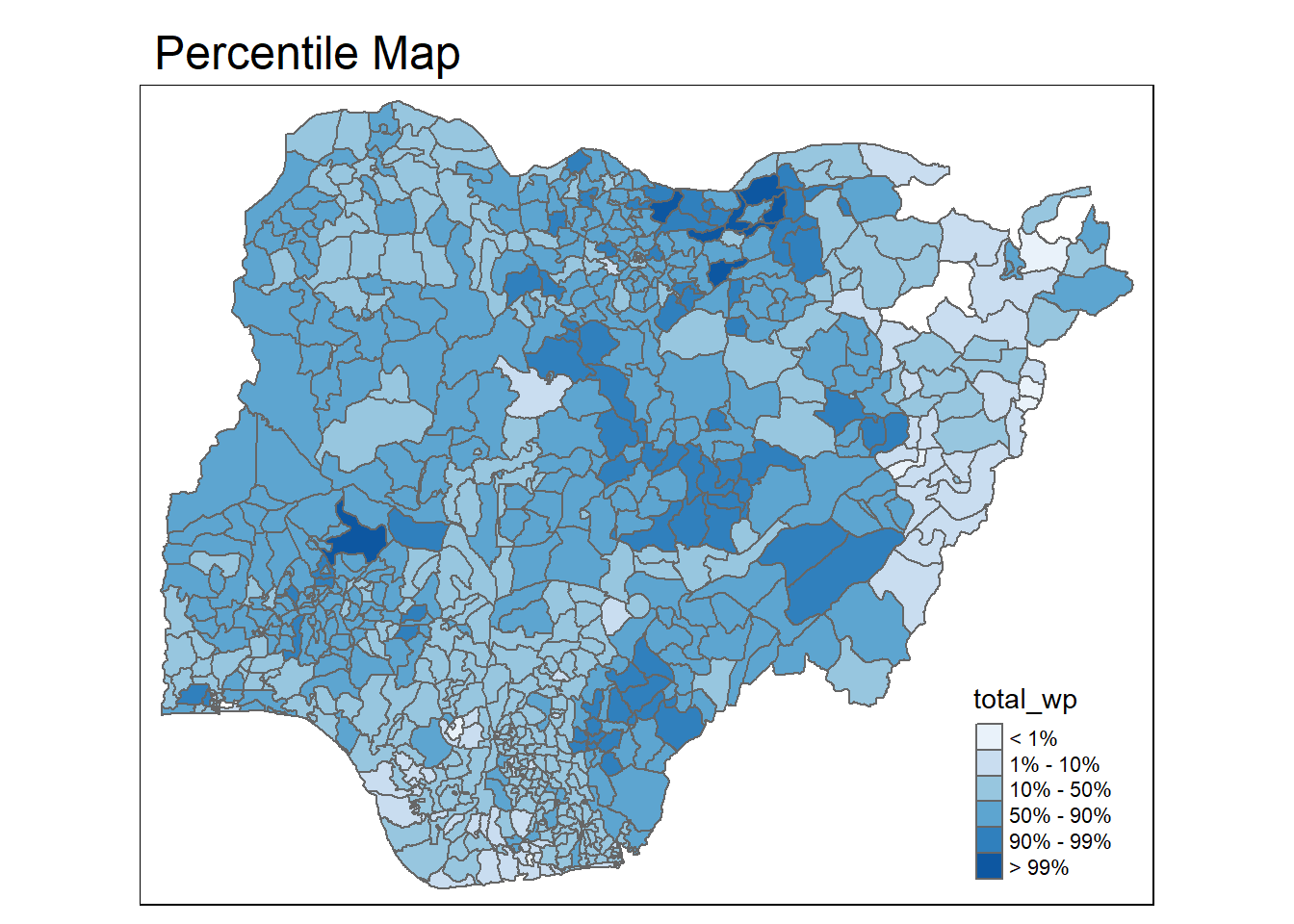
We can use additional arguments such as the title, legend positioning etc to customise various features of the map.
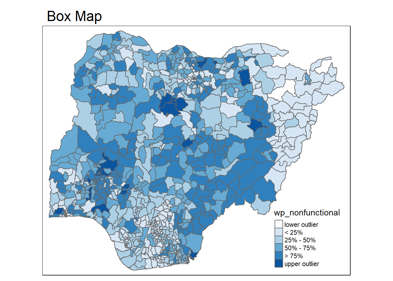
5.2 Box map
In essence, a box map is an augmented quartile map, with an additional lower and upper category. When there are lower outliers, then the starting point for the breaks is the minimum value, and the second break is the lower fence. In contrast, when there are no lower outliers, then the starting point for the breaks will be the lower fence, and the second break is the minimum value (there will be no observations that fall in the interval between the lower fence and the minimum value).
ggplot(data = NGA_wp,
       aes(x = "",
           y = wp_nonfunctional)) +
  geom_boxplot()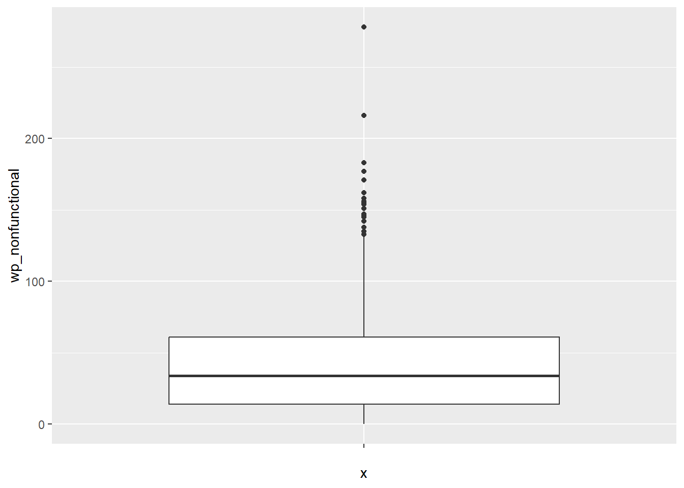
Displaying summary statistics on a choropleth map by using the basic principles of boxplot.
To create a box map, a custom breaks specification will be used. However, there is a complication. The break points for the box map vary depending on whether lower or upper outliers are present.
The code chunk below is an R function that creating break points for a box map. The return is a vector with 7 break points compute quartile and fences
boxbreaks <- function(v, IQRmult = 1.5) {
  qv <- unname(quantile(v))
  iqr <- qv[4] - qv[2]
  upfence <- qv[4] + IQRmult * iqr
  lofence <- qv[2] - IQRmult * iqr
  # initialize break points vector
  bb <- vector(mode="numeric",length=7)
  # logic for lower and upper fences
  if (lofence < qv[1]) {  # no lower outliers
    bb[1] <- lofence
    bb[2] <- floor(qv[1])
  } else {
    bb[2] <- lofence
    bb[1] <- qv[1]
  }
  if (upfence > qv[5]) { # no upper outliers
    bb[7] <- upfence
    bb[6] <- ceiling(qv[5])
  } else {
    bb[6] <- upfence
    bb[7] <- qv[5]
  }
  bb[3:5] <- qv[2:4]
  return(bb)
}
The code chunk below is an R function to extract a variable as a vector out of an sf data frame.
get.var <- function(vname,df) {
  v <- df[vname] %>% st_set_geometry(NULL)
  v <- unname(v[,1])
  return(v)
}
var <- get.var("wp_nonfunctional", NGA_wp)
boxbreaks(var)[1] -56.5 0.0 14.0 34.0 61.0 131.5 278.0The code chunk below is an R function to create a box map.
boxmap <- function(vnam, df,
                   legtitle = NA,
                   mtitle = "Box Map"){
  var <- get.var(vnam,df)
  bb <- boxbreaks(var)
  tm_shape(df) +
    tm_polygons() +
  tm_shape(df) +
     tm_fill(vnam, title=legtitle,
             breaks = bb,
             palette = "Blues",
             labels = c("lower outlier",
                     "< 25%",
                     "25% - 50%",
                     "50% - 75%",
                     "> 75%",
                     "upper outlier"))  +
  tm_borders() +
  tm_layout(main.title = mtitle,
            title.position = c("left",
                               "top"))
}tmap_mode("plot")
boxmap("wp_nonfunctional", NGA_wp)