pacman::p_load(GGally, parallelPlot, tidyverse)Hands-on Exercise 5d: Visual Multivariate Analysis with Parallel Coordinates Plot
1 Overview
Parallel coordinates plot is a data visualisation specially designed for visualising and analysing multivariate, numerical data. It is ideal for comparing multiple variables together and seeing the relationships between them. For example, the variables contribute to Happiness Index.
Parallel coordinates was invented by Alfred Inselberg in the 1970s as a way to visualize high-dimensional data. This data visualisation technique is more often found in academic and scientific communities than in business and consumer data visualizations. As pointed out by Stephen Few(2006), “This certainly isn’t a chart that you would present to the board of directors or place on your Web site for the general public. In fact, the strength of parallel coordinates isn’t in their ability to communicate some truth in the data to others, but rather in their ability to bring meaningful multivariate patterns and comparisons to light when used interactively for analysis.” For example, a parallel coordinates plot can be used to characterise clusters detected during customer segmentation.
This exercise aims to plot static and interactive parallel coordinates plots for visualising and analysing multivariate, numerical data.
2 Getting Started
2.1 Installing and loading the packages
For this exercise, the following R packages will be used.
GGally, extends ggplot2 by adding several functions to reduce the complexity of combining geometric objects with transformed data.
parcoords, package allow users the very well designed and interactive
parallel-coordinateschart ford3with the infrastructure, flexibility, and robustness ofhtmlwidgets.parallelPlot is used to construct a parallel coordinate plot for a data set with classes in last column.
2.2 Data import
The data of World Happines 2018 report will be used. The data set is downloaded from here.
wh <- read_csv("data/WHData-2018.csv")3 Static Parallel Coordinates Plot
We will plot static parallel coordinates plot by using ggparcoord() of GGally package.
ggparcoord(data = wh, columns = c(7:12))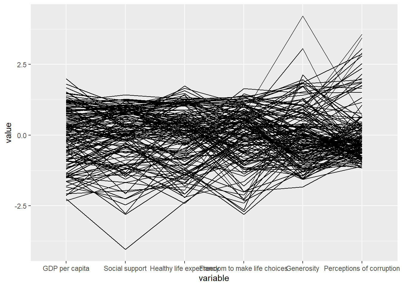
Note
Notice that only two argument namely data and columns is used. Data argument is used to map the data object (i.e. wh) and columns is used to select the columns for preparing the parallel coordinates plot.
Basic parallel coordinates failed to reveal any meaning understanding of the World Happiness measures. We can makeover the plot by using a collection of arguments provided by ggparcoord().
Show the code
ggparcoord(data = wh,
           columns = c(7:12),
           groupColumn = 2,
           scale = "uniminmax",
           alphaLines = 0.2,
           boxplot = TRUE,
           title = "Parallel Coordinates Plot of World Happiness Variables")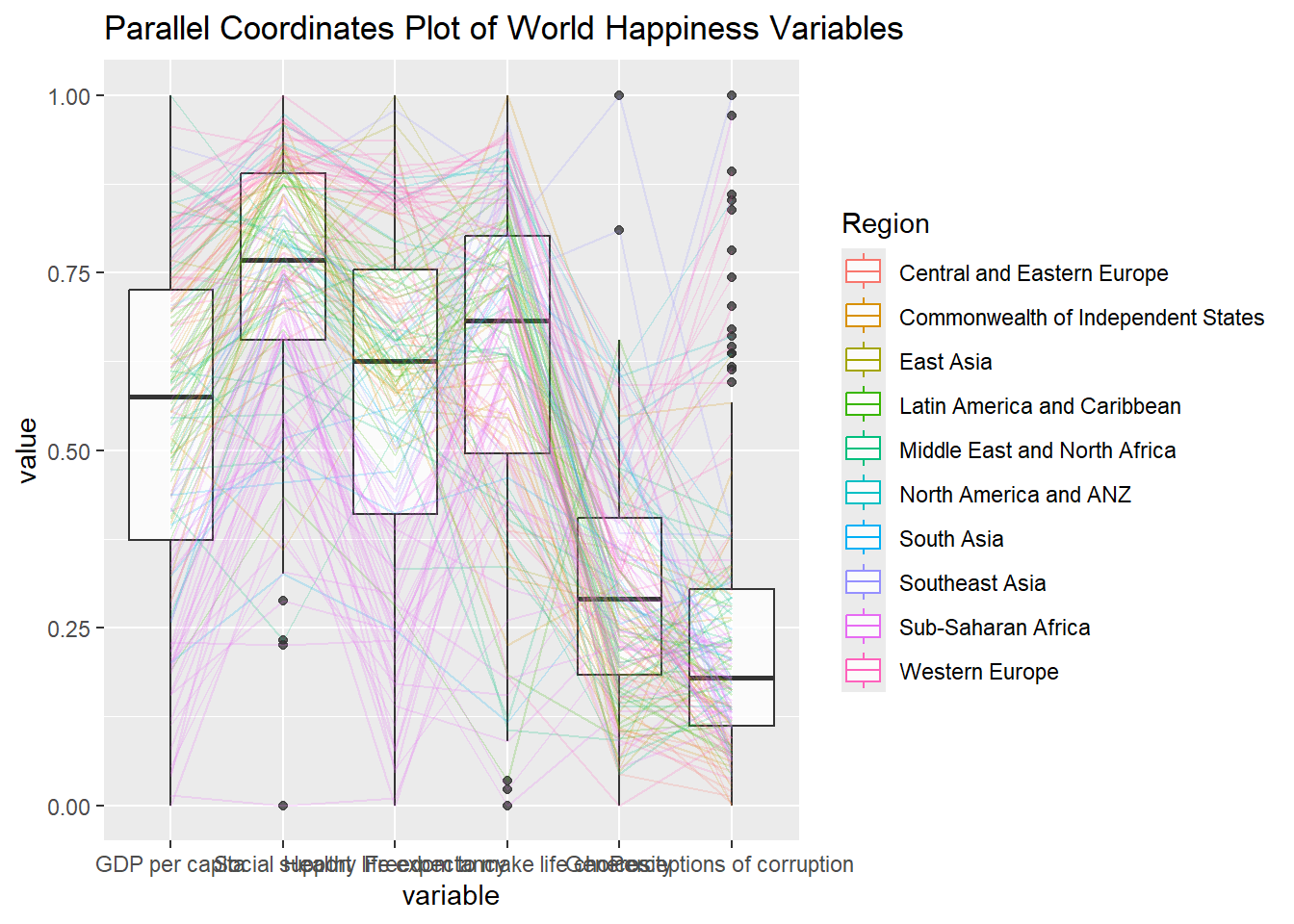
Note
groupColumnargument: to group the observations (i.e. parallel lines) by using a single variable (i.e. Region) and colour the parallel coordinates lines by region name.scaleargument: to scale the variables in the parallel coordinate plot by using uniminmax method. The method univariately scale each variable so the minimum of the variable is zero and the maximum is one.alphaLinesargument: to reduce the intensity of the line colour to 0.2. The permissible value range is between 0 to 1.boxplotargument: to turn on the boxplot by using logical TRUE. The default is FALSE.titleargument: to provide a title to the plot.
facet_wrap() of ggplot2 is used to plot 10 small multiple parallel coordinates plots. Each plot represent one geographical region such as East Asia.
Show the code
ggparcoord(data = wh,
           columns = c(7:12),
           groupColumn = 2,
           scale = "uniminmax",
           alphaLines = 0.2,
           boxplot = TRUE,
           title = "Multiple Parallel Coordinates Plots of World Happines Variables by Region") +
  facet_wrap(~ Region)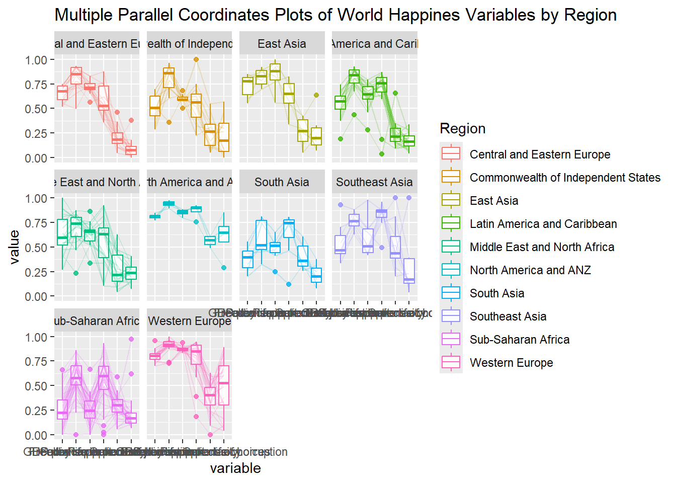
Note
One of the aesthetic defect of the current design is that some of the variable names overlap on x-axis.
To make the x-axis text label easy to read, let us rotate the labels by 30 degrees. We can rotate axis text labels using theme() function in ggplot2. We can also adjust the text location using hjust argument to theme’s text element with element_text() to avoid overlapping of x-axis labels.
Show the code
ggparcoord(data = wh,
           columns = c(7:12),
           groupColumn = 2,
           scale = "uniminmax",
           alphaLines = 0.2,
           boxplot = TRUE,
           title = "Multiple Parallel Coordinates Plots of World Happines Variables by Region") +
  facet_wrap(~ Region) +
  theme(axis.text.x = element_text(angle = 30, hjust = 1))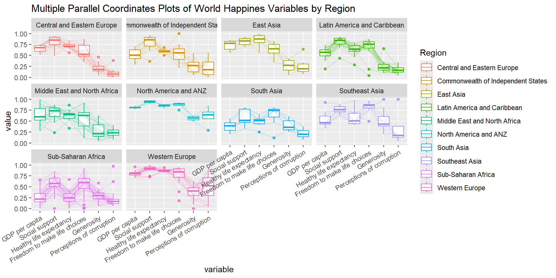
4 Interactive Parallel Coordinates Plot
parallelPlot is an R package specially designed to plot a parallel coordinates plot by using ‘htmlwidgets’ package and d3.js. In this section, you will learn how to use functions provided in parallelPlot package to build interactive parallel coordinates plot.
wh <- wh %>% select("Happiness score", c(7:12))
parallelPlot(wh,
             width = 320,
             height = 250)
rotateTitle argument is used to avoid overlapping axis labels.
parallelPlot(wh, rotateTitle = TRUE)We can change the colour scheme using continuousCS agrument.
parallelPlot(wh,
             continuousCS = "YlOrRd",
             rotateTitle = TRUE)
histoVisibility argument is used to plot histogram along the axis of each variables.
histoVisibility <- rep(TRUE, ncol(wh))
parallelPlot(wh,
             rotateTitle = TRUE,
             histoVisibility = histoVisibility)