pacman::p_load(tidyverse, FunnelPlotR, plotly, knitr)Hands-on Exercise 4d: Funnel Plots for Fair Comparisons
1 Overview
This exercise aims to gain hands-on experience in plotting funnel plots which are specially designed data visualisations for conducting unbiased comparison between outlets, stores or business entities by
plotting funnel plots by using funnelPlotR package,
plotting static funnel plot by using ggplot2 package, and
plotting interactive funnel plot by using both plotly R and ggplot2 packages.
2 Getting Started
2.1 Installing and loading the packages
For this exercise, the following R packages will be used, they are:
tidyverse, a family of R packages for data science processes,plotlyfor creating interactive plotFunnelPlotRfor creating funnel plot.knitrfor building static html table.
2.2 Data import
In this section, COVID-19_DKI_Jakarta will be used. The data was downloaded from Open Data Covid-19 Provinsi DKI Jakarta portal. For this exercise, we are going to compare the cumulative COVID-19 cases and death by sub-district (i.e. kelurahan) as at 31st July 2021, DKI Jakarta.
covid19 <- read_csv("data/COVID-19_DKI_Jakarta.csv") %>%
  mutate_if(is.character, as.factor)
covid19
# A tibble: 267 × 7
`Sub-district ID` City District `Sub-district` Positive Recovered Death
<dbl> <fct> <fct> <fct> <dbl> <dbl> <dbl>
1 3172051003 JAKARTA U… PADEMAN… ANCOL 1776 1691 26
2 3173041007 JAKARTA B… TAMBORA ANGKE 1783 1720 29
3 3175041005 JAKARTA T… KRAMAT … BALE KAMBANG 2049 1964 31
4 3175031003 JAKARTA T… JATINEG… BALI MESTER 827 797 13
5 3175101006 JAKARTA T… CIPAYUNG BAMBU APUS 2866 2792 27
6 3174031002 JAKARTA S… MAMPANG… BANGKA 1828 1757 26
7 3175051002 JAKARTA T… PASAR R… BARU 2541 2433 37
8 3175041004 JAKARTA T… KRAMAT … BATU AMPAR 3608 3445 68
9 3171071002 JAKARTA P… TANAH A… BENDUNGAN HIL… 2012 1937 38
10 3175031002 JAKARTA T… JATINEG… BIDARA CINA 2900 2773 52
# ℹ 257 more rows3 Fair Visual Comparisons
3.1 Fair Visual Comparisons using FunnelPlotR methods
FunnelPlotR package uses ggplot to generate funnel plots. It requires a numerator (events of interest), denominator (population to be considered) and group. The key arguments selected for customisation are:
limit: plot limits (95 or 99).label_outliers: to label outliers (true or false).Poisson_limits: to add Poisson limits to the plot.OD_adjust: to add overdispersed limits to the plot.xrangeandyrange: to specify the range to display for axes, acts like a zoom function.Other aesthetic components such as graph title, axis labels etc.
The following basic plot shows a funnel plot object with 267 points of which 0 are outliers. Plot is adjusted for over-dispersion.
Show the code
funnel_plot(
  numerator = covid19$Positive,
  denominator = covid19$Death,
  group = covid19$`Sub-district`)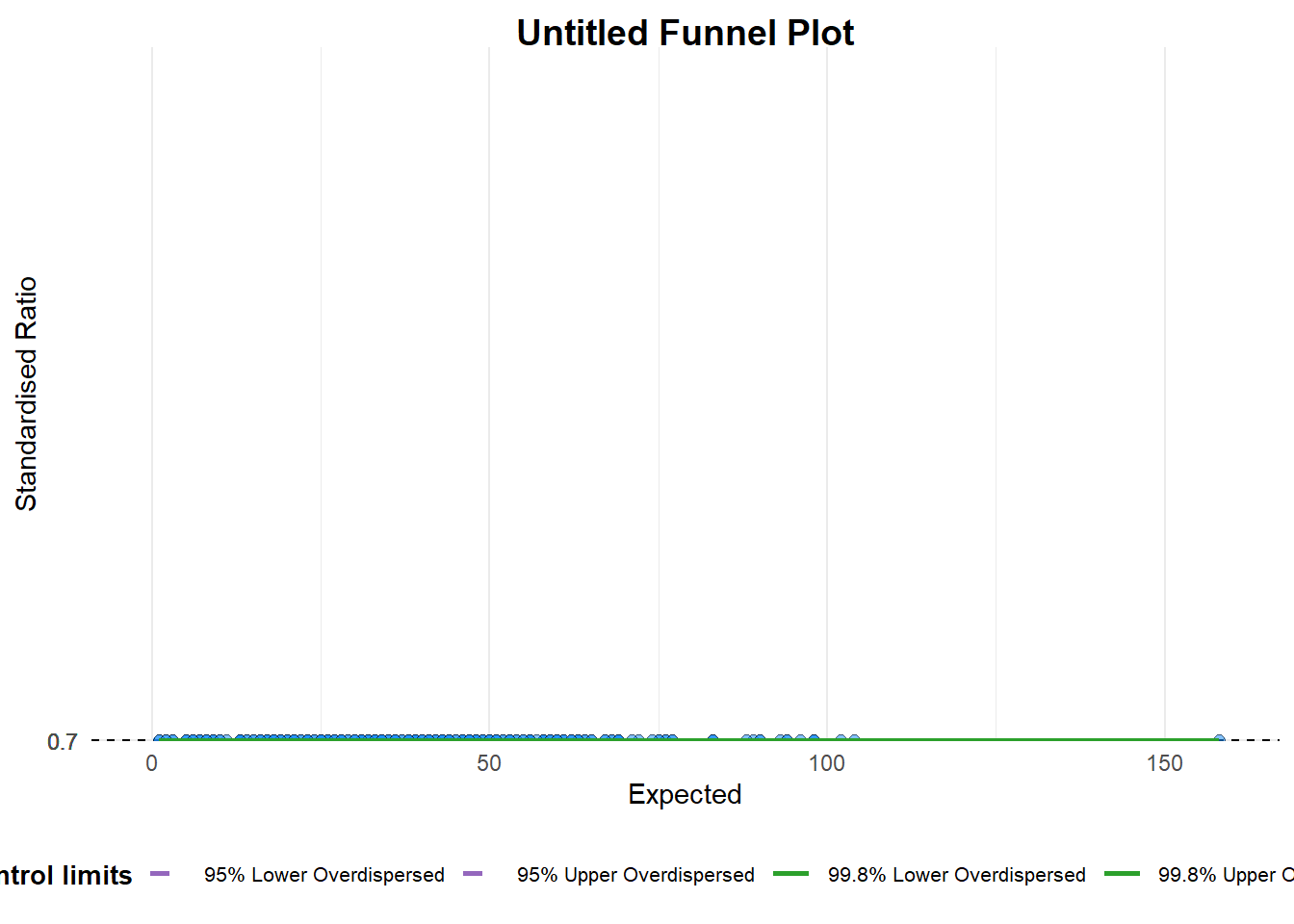
A funnel plot object with 267 points of which 0 are outliers.
Plot is adjusted for overdispersion.
Note
groupin this function is different from the scatterplot. Here, it defines the level of the points to be plotted i.e. Sub-district, District or City. If Cityc is chosen, there are only six data points.By default,
data_typeargumentis “SR” (indirectly standardised ratios). Other options: “PR” for proportions, or “RC” for ratios of counts.limit: Plot limits, accepted values are: 95 or 99, corresponding to 95% or 99.8% quantiles of the distribution.
The following funnel plot object has 267 points of which 7 are outliers. Plot is adjusted for over-dispersion.
Show the code
funnel_plot(
  numerator = covid19$Death,
  denominator = covid19$Positive,
  group = covid19$`Sub-district`,
  data_type = "PR",
  x_range = c(0, 6500),
  y_range = c(0, 0.05))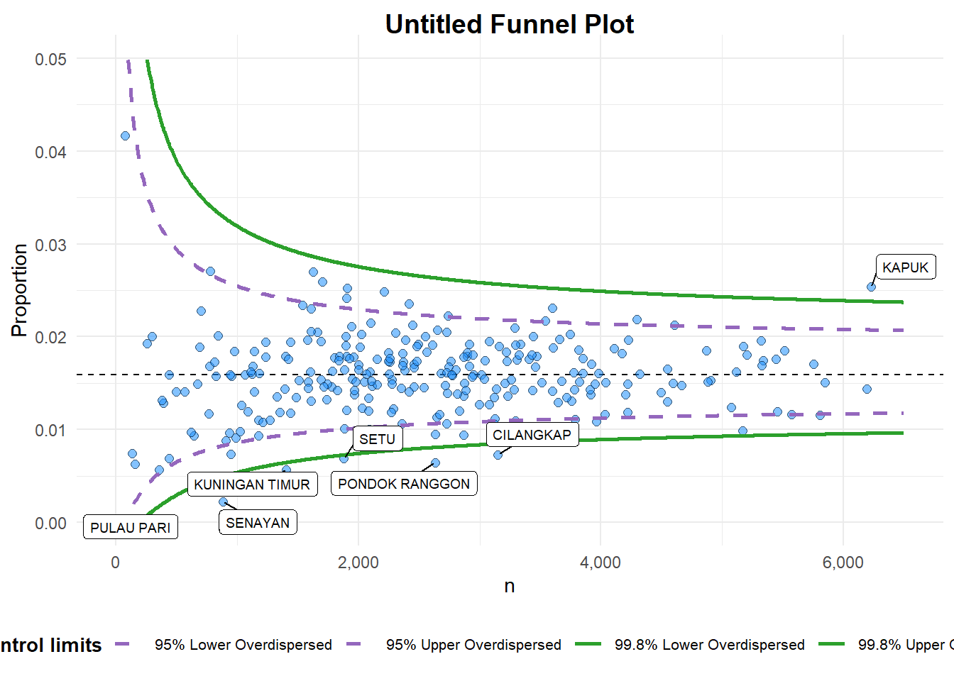
A funnel plot object with 267 points of which 7 are outliers.
Plot is adjusted for overdispersion.
Note
data_type argumentis used to change from default “SR” to “PR” (i.e. proportions).x_rangeandy_rangeare used to set the range of x-axis and y-axis
Show the code
funnel_plot(
    numerator = covid19$Death,
    denominator = covid19$Positive,
    group = covid19$`Sub-district`,
    data_type = "PR",
    x_range = c(0, 6500),
    y_range = c(0, 0.05),
    label = NA,
    title = "Cumulative COVID-19 Fatality Rate by \nCumulative Total Number of COVID-19 Positive Cases", #<<
    x_label = "Cumulative COVID-19 Positive Cases",
    y_label = "Cumulative Fatality Rate")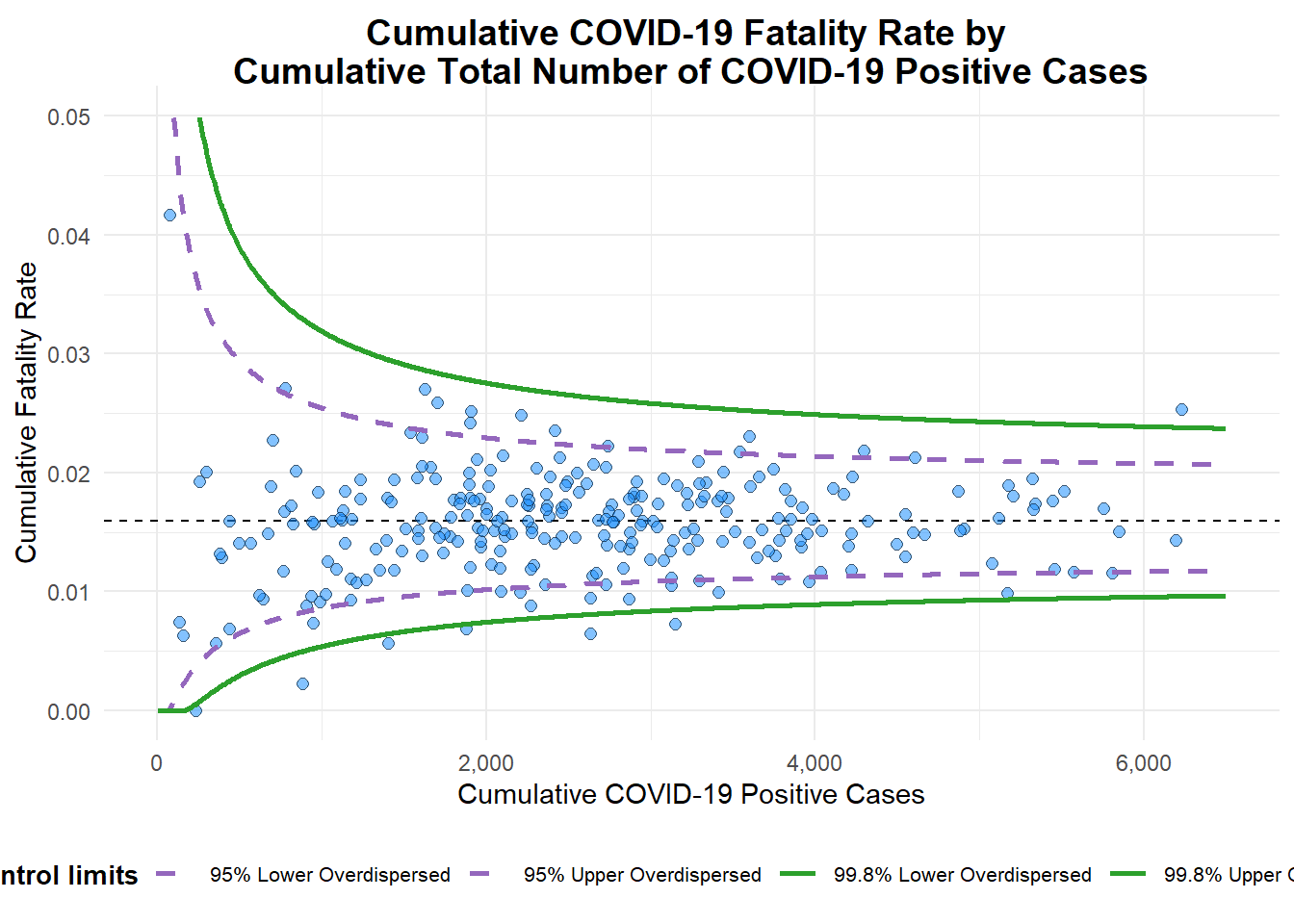
A funnel plot object with 267 points of which 7 are outliers.
Plot is adjusted for overdispersion.
Note
label= NA argument is to removed the default label outliers feature.titleargument is used to add plot title.x_labelandy_labelarguments are used to add/edit x-axis and y-axis titles.
3.2 Fair Visual Comparisons using ggplot2 methods
We can also build funnel plots step-by-step by using ggplot2. It aims to enhance you working experience of ggplot2 to customise speciallised data visualisation like funnel plot.
We need to create some statistics from the data first by deriving cumulative death rate and standard error of cumulative death rate.
df <- covid19 %>%
  mutate(rate = Death / Positive) %>%
  mutate(rate.se = sqrt((rate*(1-rate)) / (Positive))) %>%
  filter(rate > 0)
fit.mean <- weighted.mean(df$rate, 1/df$rate.se^2)
Compute the upper and lower limits for 95% confidence interval.
number.seq <- seq(1, max(df$Positive), 1)
number.ll95 <- fit.mean - 1.96 * sqrt((fit.mean*(1-fit.mean)) / (number.seq))
number.ul95 <- fit.mean + 1.96 * sqrt((fit.mean*(1-fit.mean)) / (number.seq))
number.ll999 <- fit.mean - 3.29 * sqrt((fit.mean*(1-fit.mean)) / (number.seq))
number.ul999 <- fit.mean + 3.29 * sqrt((fit.mean*(1-fit.mean)) / (number.seq))
dfCI <- data.frame(number.ll95, number.ul95, number.ll999,
number.ul999, number.seq, fit.mean)Show the code
p <- ggplot(df, aes(x = Positive, y = rate)) +
  geom_point(aes(label= `Sub-district`), alpha=0.4) +
  geom_line(data = dfCI,
            aes(x = number.seq, y = number.ll95),
            size = 0.4,
            colour = "grey40",
            linetype = "dashed") +
  geom_line(data = dfCI,
            aes(x = number.seq, y = number.ul95),
            size = 0.4,
            colour = "grey40",
            linetype = "dashed") +
  geom_line(data = dfCI,
            aes(x = number.seq, y = number.ll999),
            size = 0.4,
            colour = "darkblue") +
  geom_line(data = dfCI,
            aes(x = number.seq, y = number.ul999),
            size = 0.4,
            colour = "darkblue") +
  geom_hline(data = dfCI,
             aes(yintercept = fit.mean),
             linewidth = 0.4,
             colour = "darkred") +
  coord_cartesian(ylim=c(0,0.05)) +
  labs(title = "Cumulative Fatality Rate by Cumulative Number of COVID-19 Cases",
       x = "Cumulative Number of COVID-19 Cases",
       y = "Cumulative Fatality Rate") +
  theme_light() +
  theme(plot.title = element_text(size = 12),
        legend.position = c(0.91, 0.85),
        legend.title = element_text(size=7),
        legend.text = element_text(size=7),
        legend.background = element_rect(colour = "grey60", linetype = "dotted"),
        legend.key.height = unit(0.3, "cm")) +
  annotate("text", x = 100, y = 0.03, label = "95%", size = 3, colour = "red") +
  annotate("text", x = 600, y = 0.035, label = "99%", size = 3, colour = "red")

p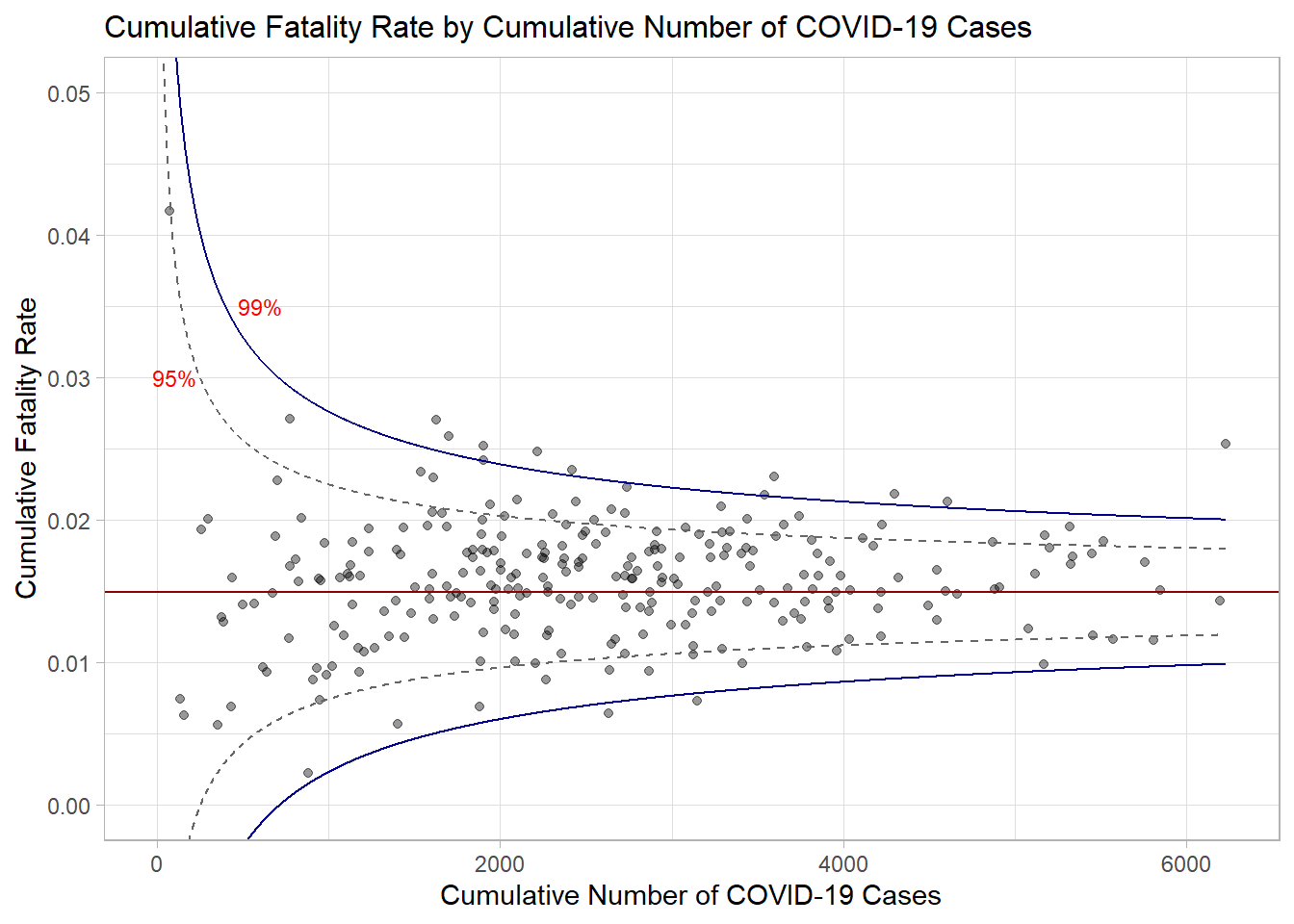
Use ggplotly to make the chart interactive.
ggplotly(p,tooltip = c("label", "x", "y"))