#devtools::install_github("wilkelab/ungeviz")
pacman::p_load(ungeviz, plotly, crosstalk,
               DT, ggdist, ggridges,
colorspace, gganimate, tidyverse)Hands-on Exercise 4c: Visualing Uncertainty
1 Overview
This exercise aims to gain hands-on experience on creating statistical graphics for visualising uncertainty by:
plotting statistics error bars by using ggplot2,
plotting interactive error bars by combining ggplot2, plotly and DT,
creating advanced by using ggdist, and
creating hypothetical outcome plots (HOPs) by using ungeviz package.
2 Getting Started
2.1 Installing and loading the packages
For this exercise, the following R packages will be used, they are:
tidyverse, a family of R packages for data science processes,plotlyfor creating interactive plotgganimatefor creating animation plotDTfor displaying interactive html tablecrosstalkfor for implementing cross-widget interactions (currently, linked brushing and filtering)
2.2 Data import
The following dataset is used for this exercise.
exam_data <- read_csv("data/Exam_data.csv")
exam_data
# A tibble: 322 × 7
ID CLASS GENDER RACE ENGLISH MATHS SCIENCE
<chr> <chr> <chr> <chr> <dbl> <dbl> <dbl>
1 Student321 3I Male Malay 21 9 15
2 Student305 3I Female Malay 24 22 16
3 Student289 3H Male Chinese 26 16 16
4 Student227 3F Male Chinese 27 77 31
5 Student318 3I Male Malay 27 11 25
6 Student306 3I Female Malay 31 16 16
7 Student313 3I Male Chinese 31 21 25
8 Student316 3I Male Malay 31 18 27
9 Student312 3I Male Malay 33 19 15
10 Student297 3H Male Indian 34 49 37
# ℹ 312 more rows3 Visualizing the Uncertainty
3.1 Visualizing the uncertainty of point estimates: ggplot2 methods
A point estimate is a single number, such as a mean. Uncertainty, on the other hand, is expressed as standard error, confidence interval, or credible interval.
Let’s plot error bars of maths scores by race by using data provided in exam_data tibble data frame and then display the information in an HTML table format.
Show the code
my_sum <- exam_data %>%
  group_by(RACE) %>%
  summarise(n = n(),
          mean = mean(MATHS),
          sd = sd(MATHS)) %>%
  mutate(se = sd/sqrt(n-1))
knitr::kable(head(my_sum), format = 'html')| RACE | n | mean | sd | se |
|---|---|---|---|---|
| Chinese | 193 | 76.50777 | 15.69040 | 1.132357 |
| Indian | 12 | 60.66667 | 23.35237 | 7.041005 |
| Malay | 108 | 57.44444 | 21.13478 | 2.043177 |
| Others | 9 | 69.66667 | 10.72381 | 3.791438 |
Note
group_by()of dplyr package is used to group the observation by RACE,summarise()is used to compute the count of observations, mean, standard deviationmutate()is used to derive the standard error of Maths by RACE, and the output is saved as a tibble data table called my_sum.
Let’s plot the standard error bars of mean maths score by race as shown below.
Show the code
ggplot(my_sum) +
  geom_errorbar(aes(x = RACE,
                  ymin = mean - se,
                  ymax = mean + se),
              width=0.2,
              colour="black",
              alpha=0.9,
              size=0.5) +
  geom_point(aes(x = RACE, y = mean),
           stat = "identity",
           color = "red",
           size = 1.5,
           alpha = 1) +
  ggtitle("Standard error of mean maths scores by race")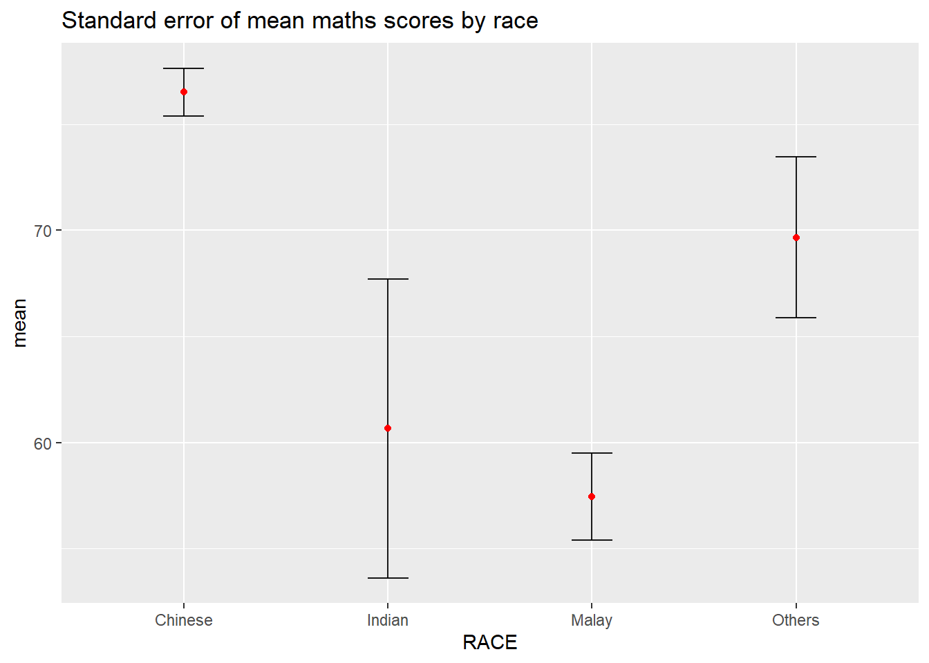
Important
For geom_point(), it is important to indicate stat = “identity”.
Instead of plotting the standard error bar of point estimates, we can also plot the confidence intervals of mean maths score by race.
Show the code
ggplot(my_sum) +
  geom_errorbar(
            aes(x=reorder(RACE, -mean),
                ymin = mean - 1.96*se,
                ymax = mean + 1.96*se),
            width=0.2,
            colour="black",
            alpha=0.9,
            size=0.5) +
  geom_point(aes
           (x=RACE, y=mean),
           stat = "identity",
           color="red",
           size = 1.5,
           alpha=1) +
  labs(title = "95% confidence interval of mean maths scores by race")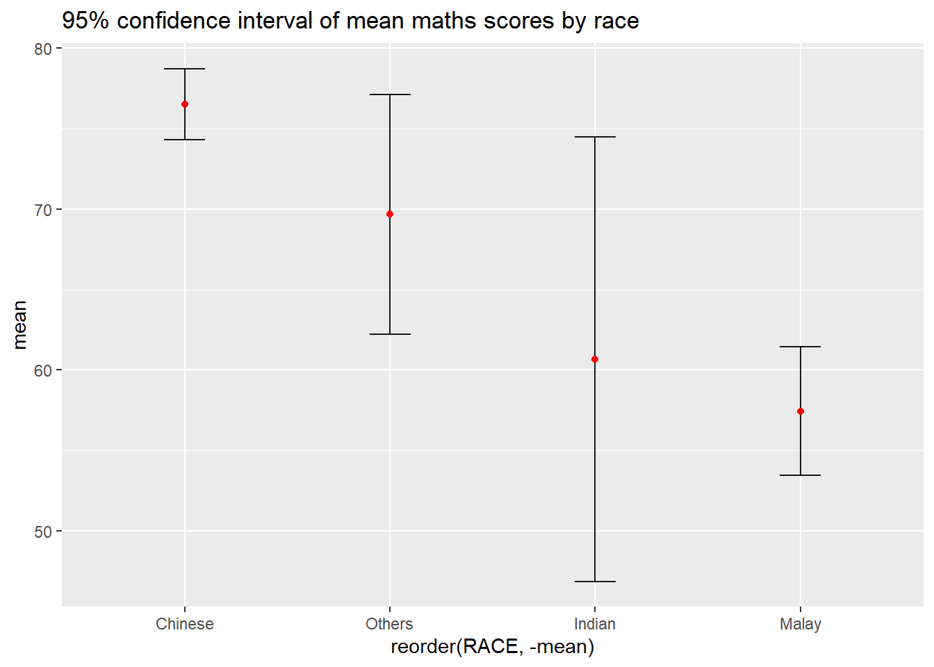
Note
The confidence intervals are computed by using the formula mean+/-1.96*se.
The error bars is sorted by using the average maths scores.
Let’s plot interactive error bars for the 99% confidence interval of mean maths score by race as shown in the figure below.
Show the code
shared_df = SharedData$new(my_sum)

bscols(widths = c(4,8),
       ggplotly((ggplot(shared_df) +
                   geom_errorbar(aes(
                     x = reorder(RACE, -mean),
                     ymin = mean - 2.58*se,
                     ymax = mean + 2.58*se),
                     width = 0.2,
                     colour = "black",
                     alpha = 0.9,
                     size = 0.5) +
           geom_point(aes(x = RACE, y = mean,
                 text = paste("Race:", `RACE`,
                              "<br>N:", `n`,
                              "<br>Avg. Scores:", round(mean, 2),
                              "<br>95% CI:[",
                              round((mean - 2.58*se), 2), ",",
                              round((mean + 2.58*se), 2),"]")),
                 stat="identity",
                 color="red",
                 size = 1.5,
                 alpha=1) +
            labs(x = "Race", y = "Average Scores",
                 title = "99% Confidence interval of average /<br>maths scores by race")) +
            theme_minimal() +
            theme(axis.text.x = element_text(
                  angle = 45, vjust = 0.5, hjust=1)), tooltip = "text"),

       DT::datatable(shared_df,
                     rownames = FALSE,
                     class="compact",
                     width="100%",
                     options = list(pageLength = 10,
                                    scrollX=T),
                     colnames = c("No. of pupils",
                                  "Avg Scores",
                                  "Std Dev",
                                  "Std Error")) %>%
         formatRound(columns=c('mean', 'sd', 'se'),
                     digits=2))
3.2 Visualizing the uncertainty of point estimates: ggdist methods
ggdist is an R package that provides a flexible set of ggplot2 geoms and stats designed especially for visualising distributions and uncertainty.
It is designed for both frequentist and Bayesian uncertainty visualization, taking the view that uncertainty visualization can be unified through the perspective of distribution visualization:
for
frequentistmodels, one visualises confidence distributions or bootstrap distributions (see vignette(“freq-uncertainty-vis”));for
Bayesianmodels, one visualises probability distributions (see the tidybayes package, which builds on top of ggdist).
stat_pointinterval() of ggdist is used to build a visual for displaying distribution of maths scores by race.
Show the code
exam_data %>%
  ggplot(aes(x = RACE, y = MATHS)) +
  stat_pointinterval(point_interval = "median_qi",
                show.legend = FALSE) +
  labs( title = "Visualising confidence intervals of mean Maths scores",
    subtitle = "Mean Point + Multiple-interval plot")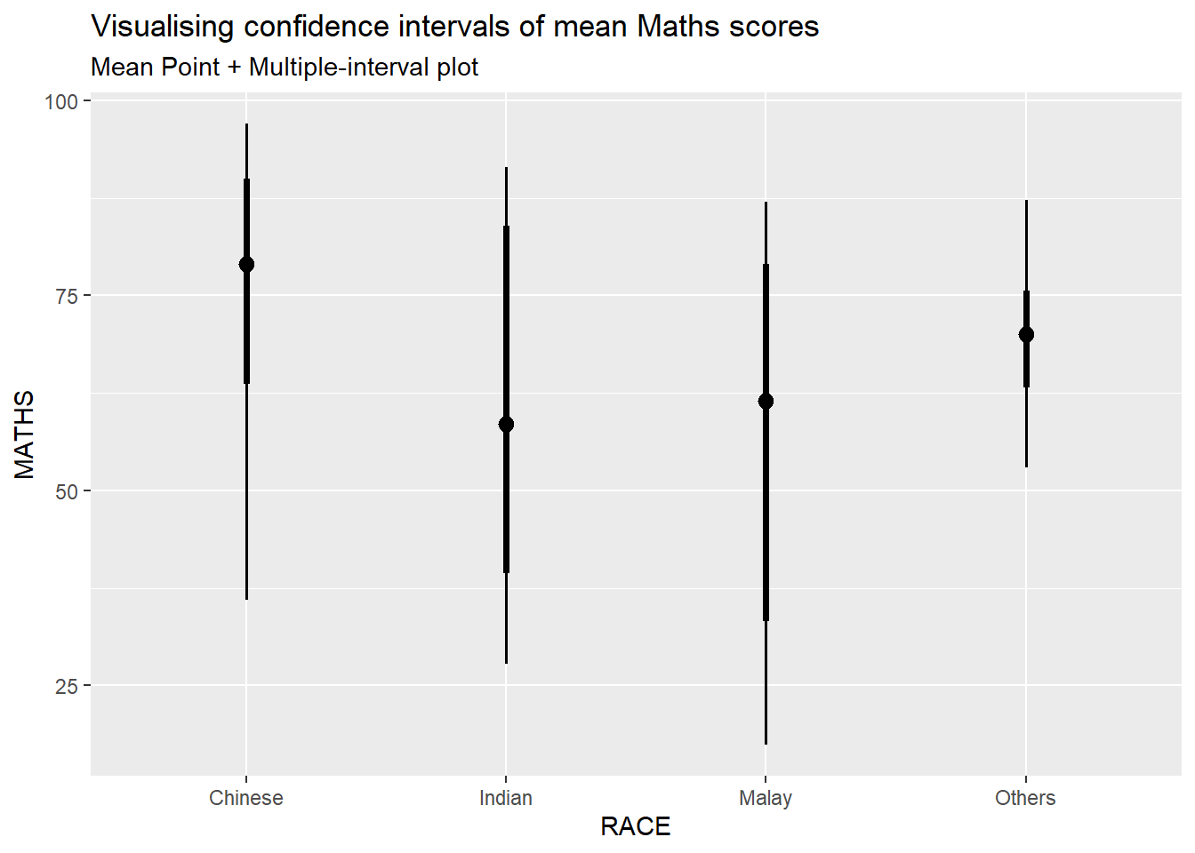
stat_gradientinterval() of ggdist is used to build a visual for displaying distribution of maths scores by race.
Show the code
ggplot(exam_data, aes(x = RACE, y = MATHS)) +
  stat_gradientinterval(
    fill = "skyblue",
    show.legend = TRUE) +
  labs(title = "Visualising confidence intervals of mean Maths scores",
    subtitle = "Gradient + interval plot")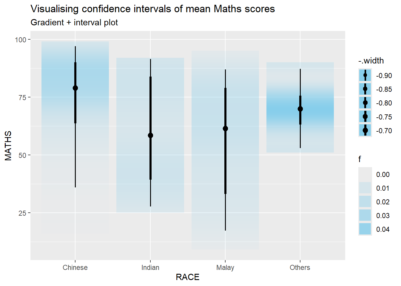
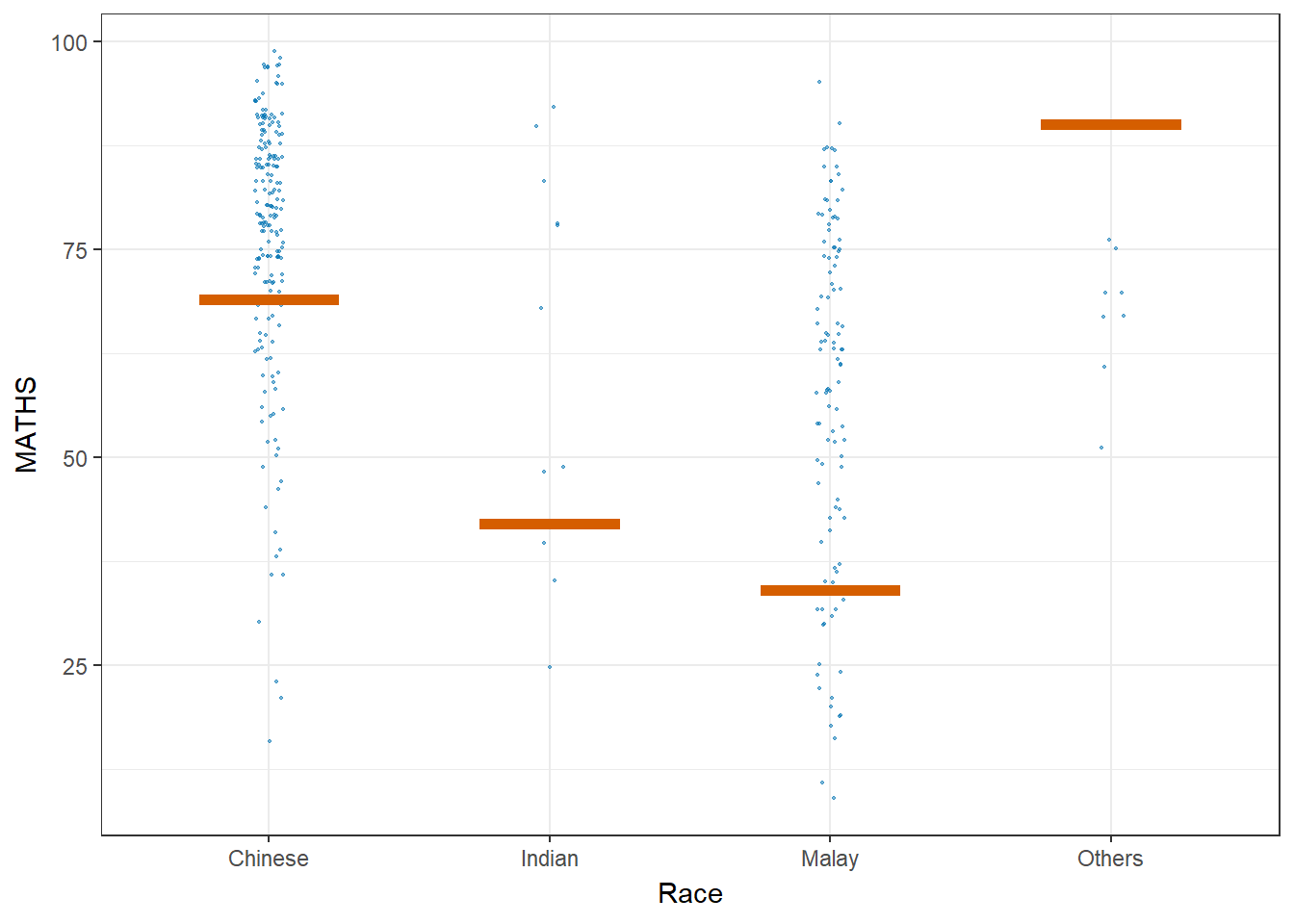
Let’ plot using Hypothetical Outcome Plots (HOPs) where users can visualize a set of draws from a distribution, where each draw is shown as a new plot in either a small multiples or animated form.
Show the code
ggplot(data = exam_data,
       (aes(x = factor(RACE), y = MATHS))) +
  geom_point(position = position_jitter(
    height = 0.3, width = 0.05),
    size = 0.4, color = "#0072B2", alpha = 0.5) +
  geom_hpline(data = sampler(25, group = RACE),
              height = 0.6, color = "#D55E00") +
  theme_bw() +
  labs(x = "Race") +
  transition_states(.draw, 1, 3)